
Over / Under
2025
Focus
Brand Identity
Motion Design
Packaging
Environmental Design
Illustration
Project Type
Hospitality Branding
Self-initiated
Over/Under is a concept for a New York hospitality brand that combines a capsule hotel and listening bar. Built around the relationship between privacy and connection, the system gives each space a distinct atmosphere while keeping them tied together as one identity.
Problem

How can hospitality respect
solitude and connection?
Not as opposites, but designed to coexist
Over/Under started by asking why New York had not developed a middle ground between hostels and hotels.
Travelers either compromise privacy to save money or pay a premium for isolation. Capsule hotels offer a solution, yet they are scarce and costly. While studying in Japan, I stayed in several capsule hotels around the country. They were affordable, convenient, and well-designed, accommodating people of all ages while maintaining respect and autonomy. Observing these spaces revealed how design can balance independence and connection. Applying that approach to Over/Under, the concept informs every aspect of the brand. Design decisions in layout, materials, interactivity, and color guide how guests move between rest and engagement.
When you’re done with your
day you come here to stay
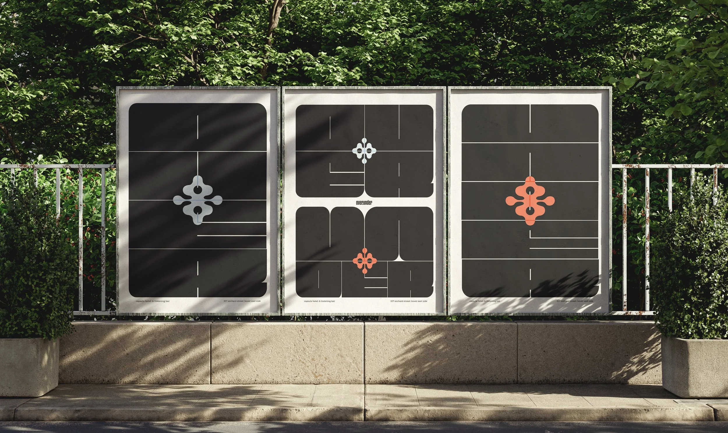
Identity System

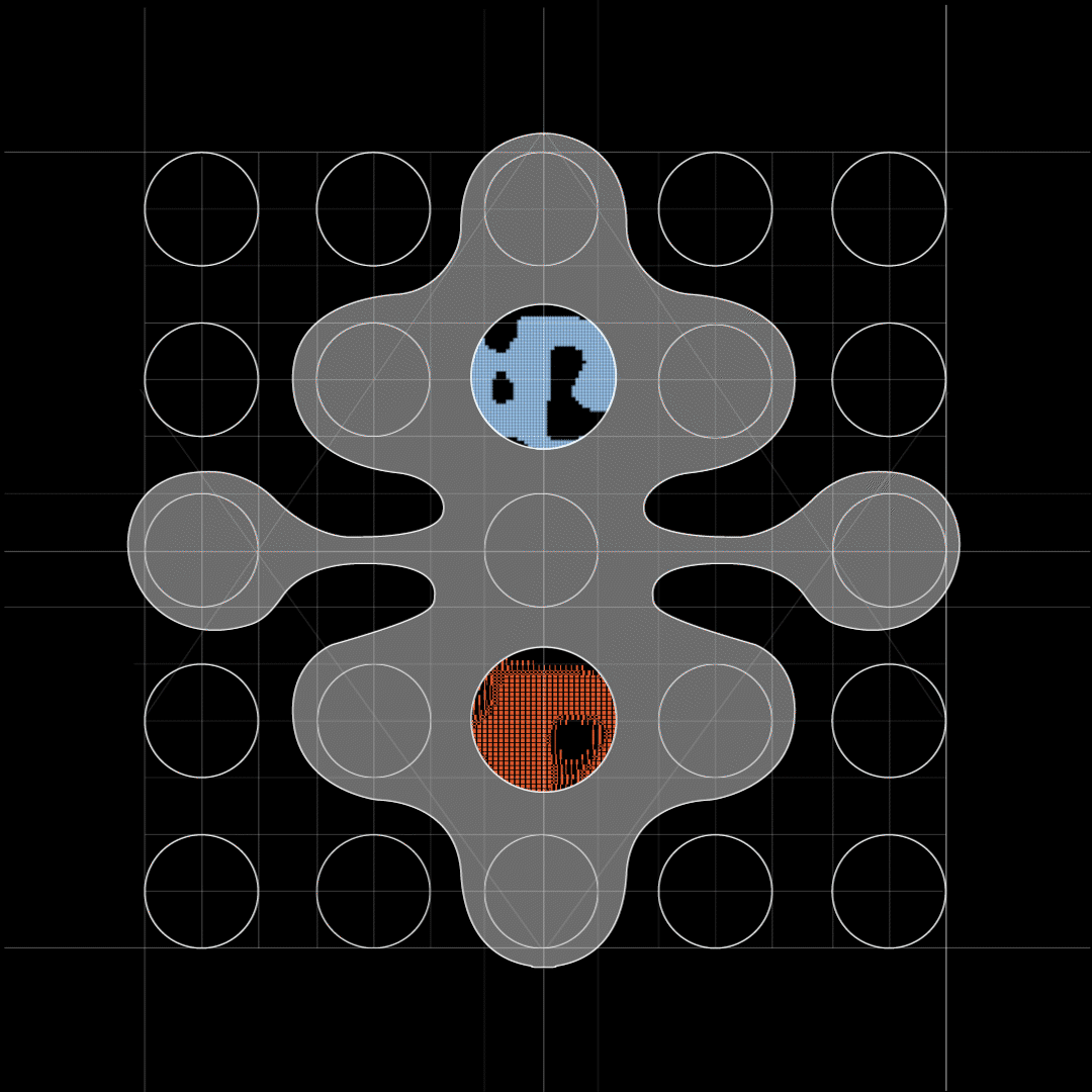
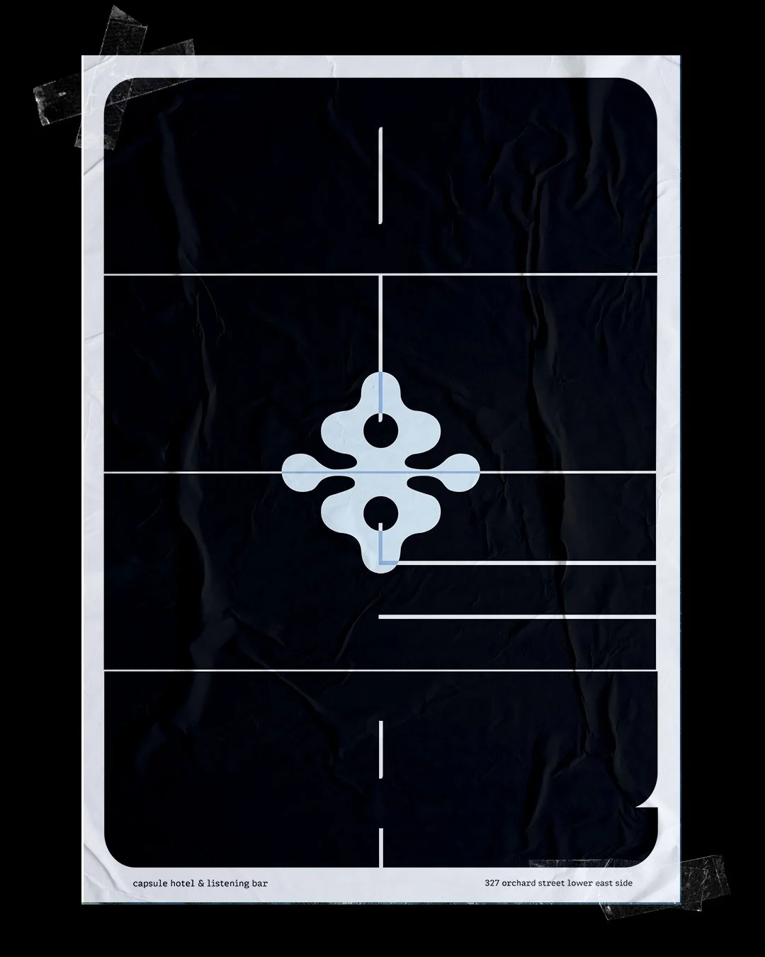
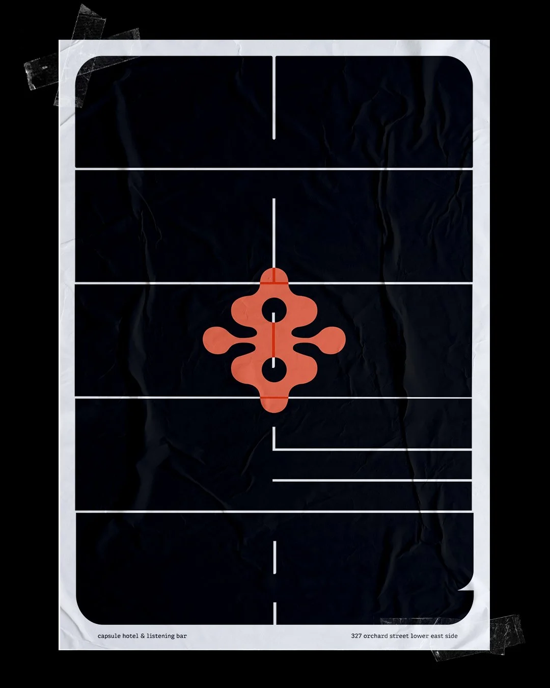
The identity system builds directly from the concept of Over/Under. The name reflects the duality of the experience, with Over representing the capsule hotel and Under the listening bar. This relationship is expressed through geometry and color, with blue assigned to Over and orange to Under. The layering seen in capsules and vinyl records extends into design choices across materials, graphics, and icons, creating cohesion while guiding how guests move through and interact with the space.
Brand Mark
Color Palette

listening room
U
Under in Over/Under is the listening room on the ground level, open to both guests and the public. It uses warm colors, tactile materials, motion, and layered compositions to create a space for connection while remaining cohesive with the overall brand identity. Orange defines the space and builds contrast with the calm tone of Over.
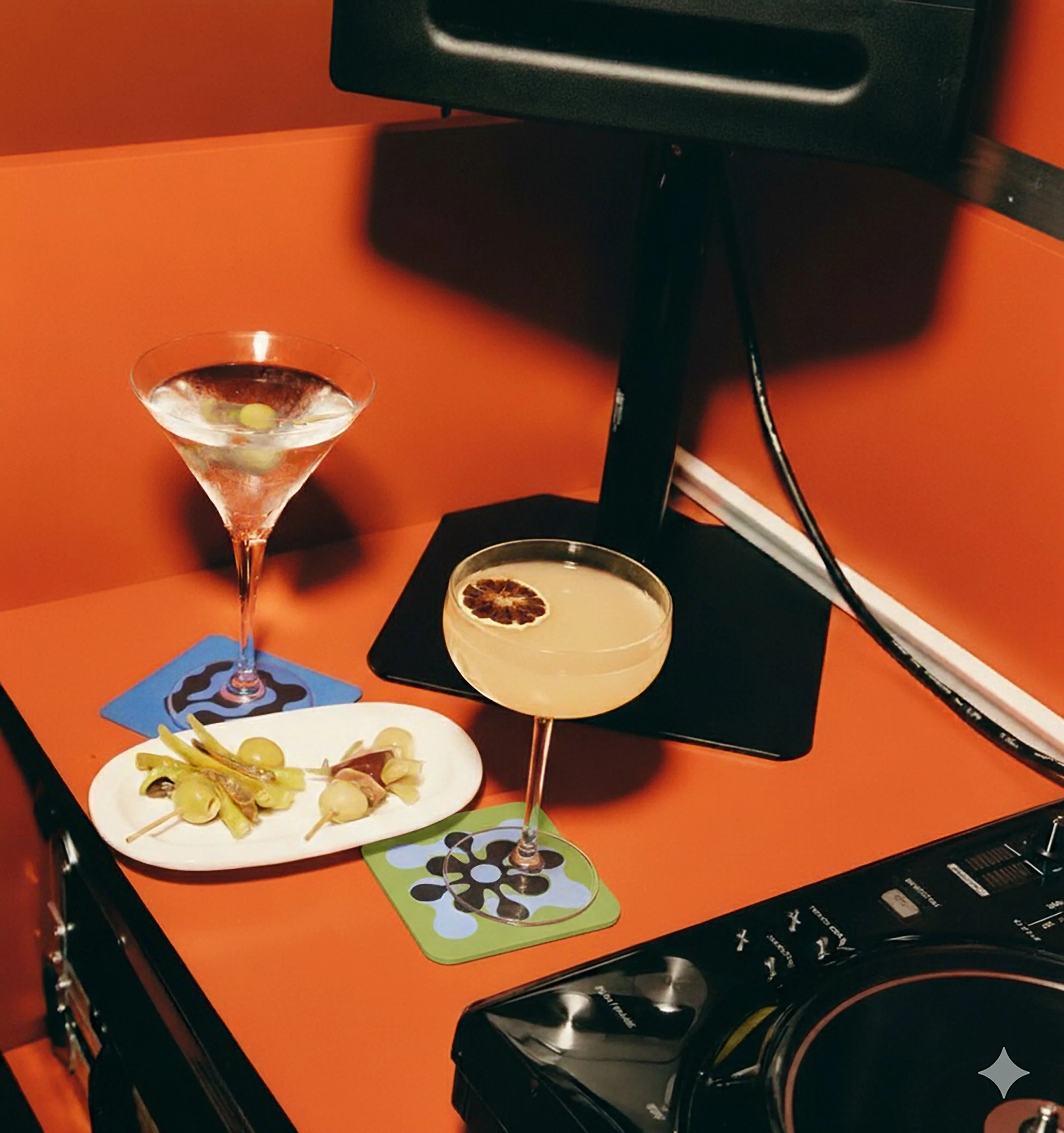
The coasters feature elevated icons built from layered forms, connecting back to the brand’s core idea of structure and rhythm.

designed for slowness
Layered like a tracklist, the drink menu encourages a slower, more intentional interaction. This deliberate design to control pacing invites guests to slow down and engage with each section intentionally.


Designed as a paper menu inside a record sleeve, it references the physicality of vinyl. The die-cut holes mark each section and guide guests to interact slowly and intentionally.

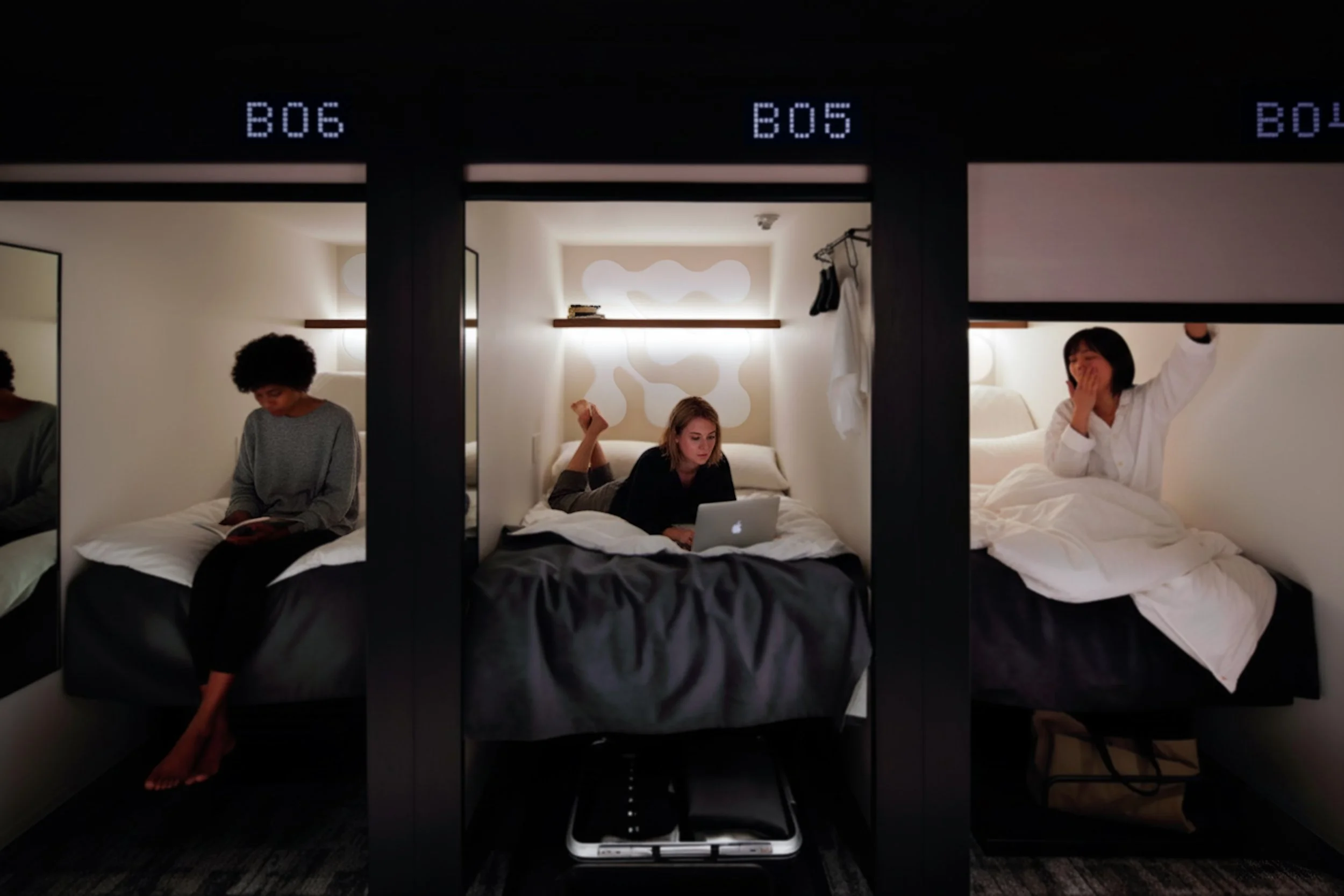
capsule hotel
O
Over, the capsule hotel portion of Over/Under, balances the lively personality of the listening bar with a calm, private environment. The challenge was adapting a bold, social brand into a restful space for guests.


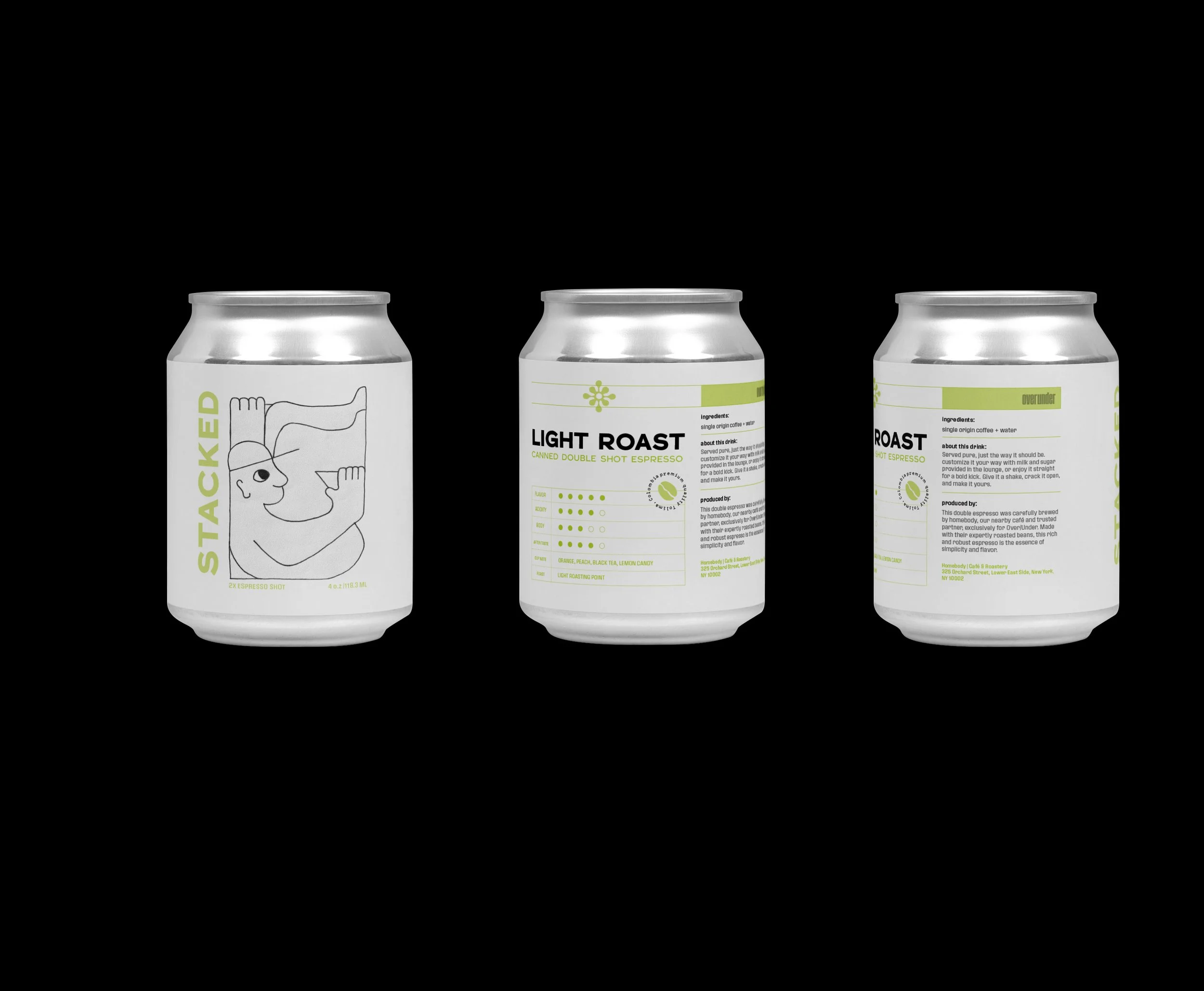
Stacked beverages are served in the lounge each morning, brewed by a local café specifically for Over/Under. Guests can enjoy the two-shot espresso as-is or customize their drink with the provided ingredients, giving them control over their morning without interrupting their plans.
full case study —->
hotel keycard
canned esspresso
03


Tyler School of
Art & Architecture
Instructors:
Angela Riechers & Courtney Spencer