FRONTYARD
2025
Focus
Publication Design
Print Production
Photography
Structural Design
Project Type
Publication Series
BFA Thesis
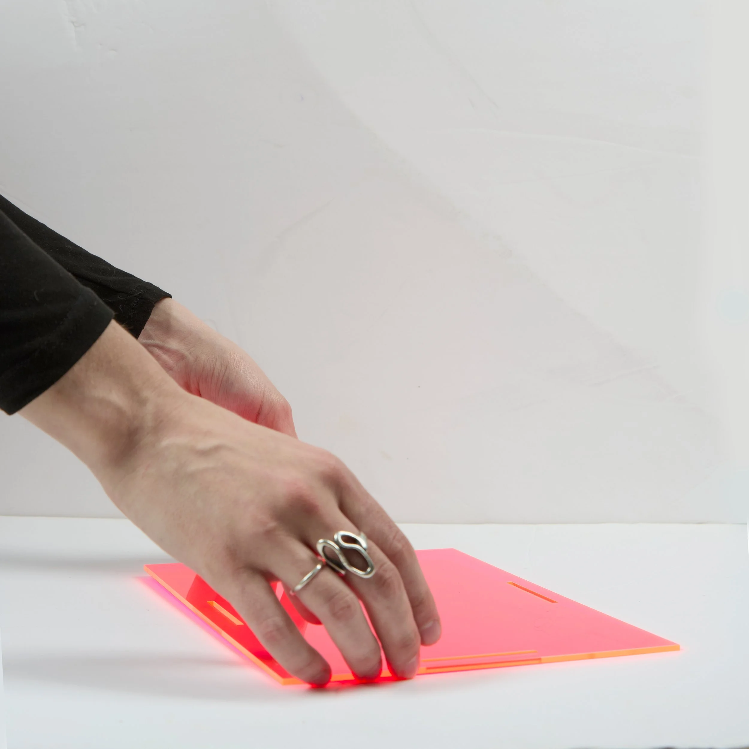
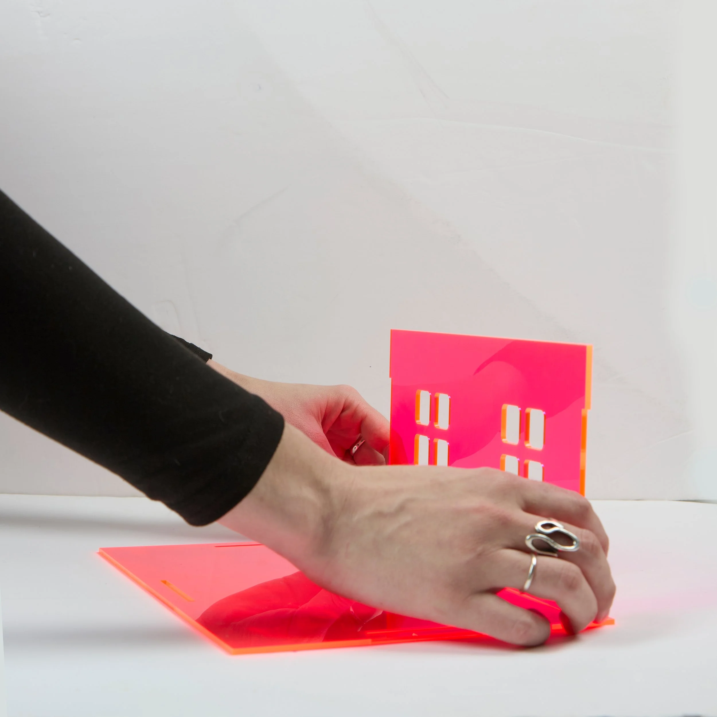
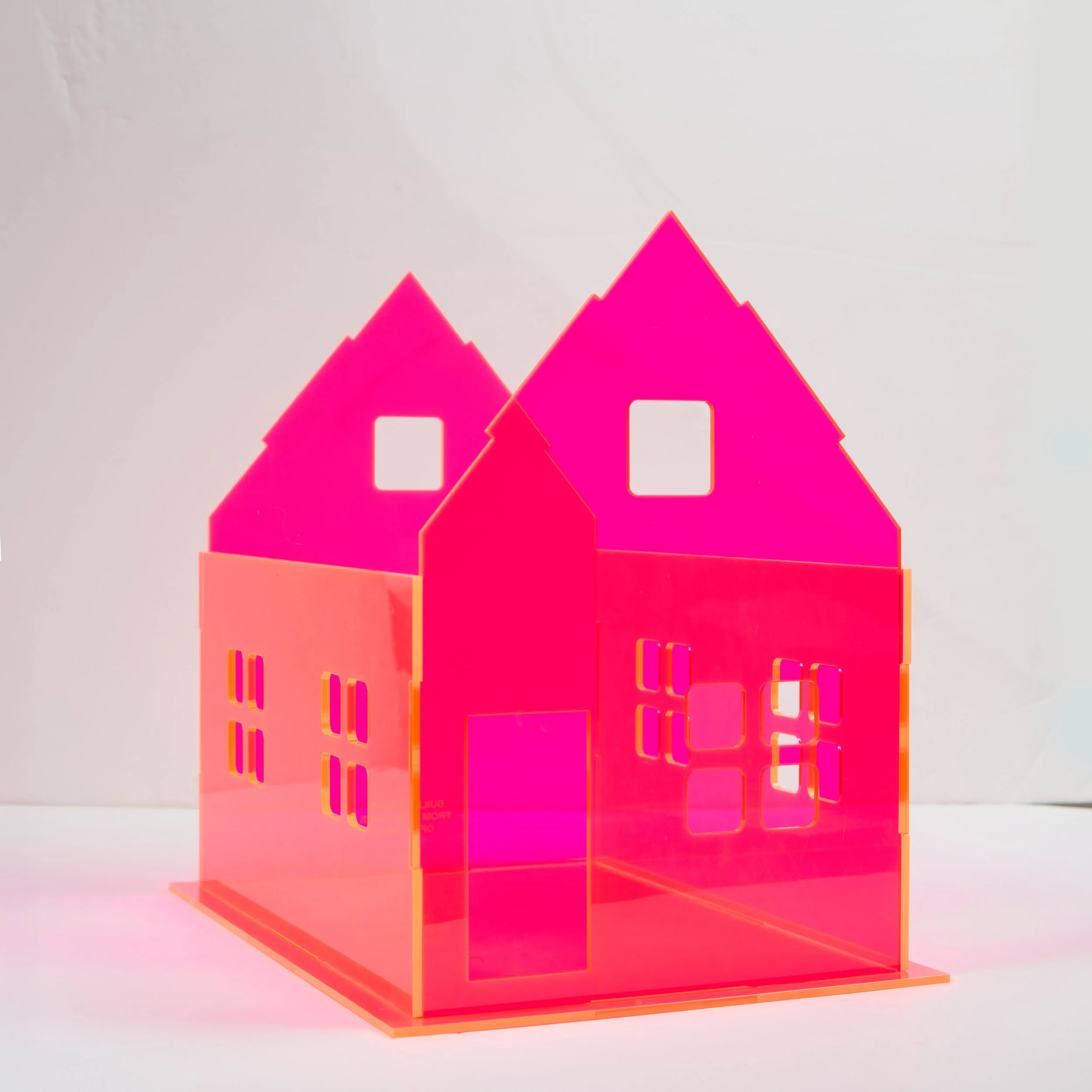
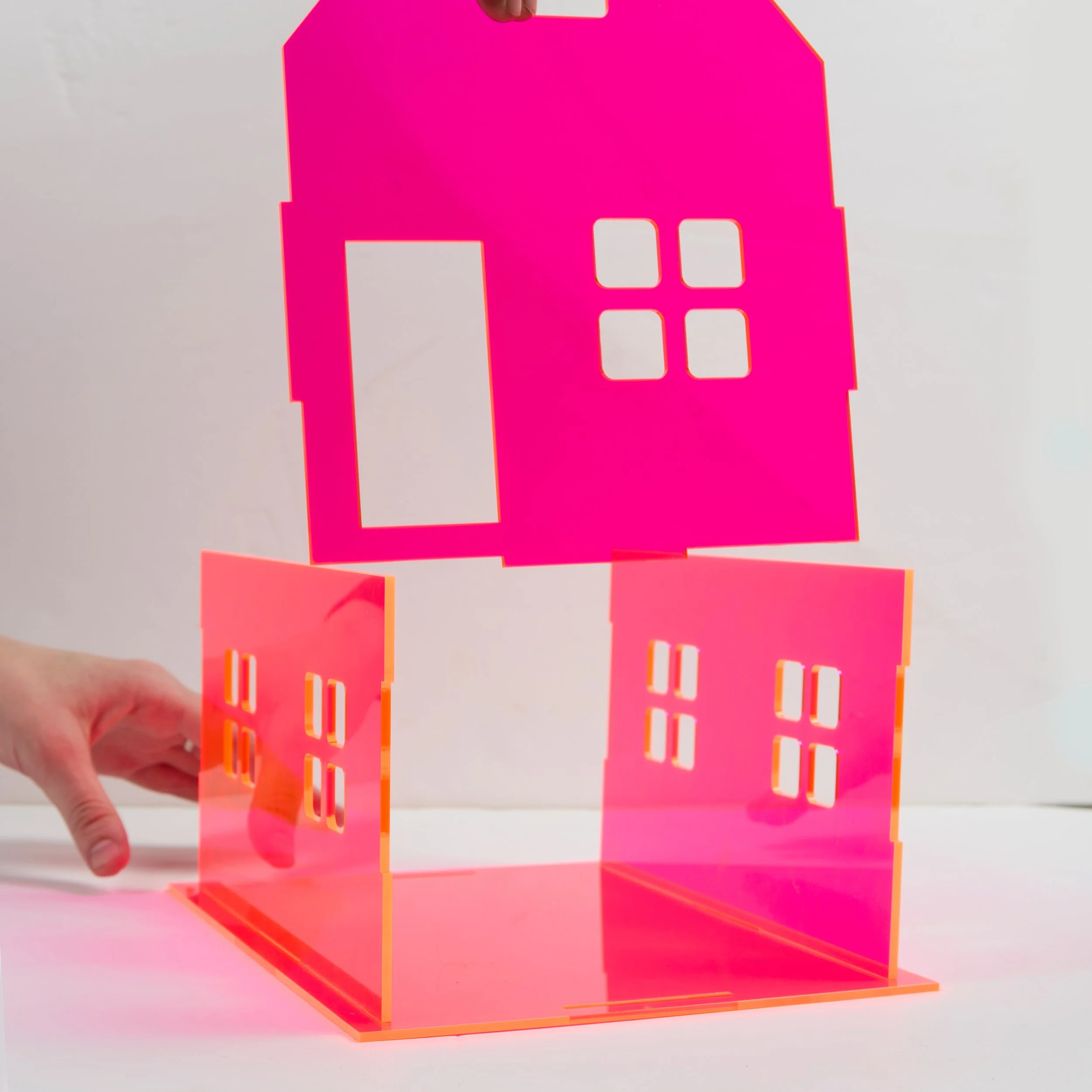
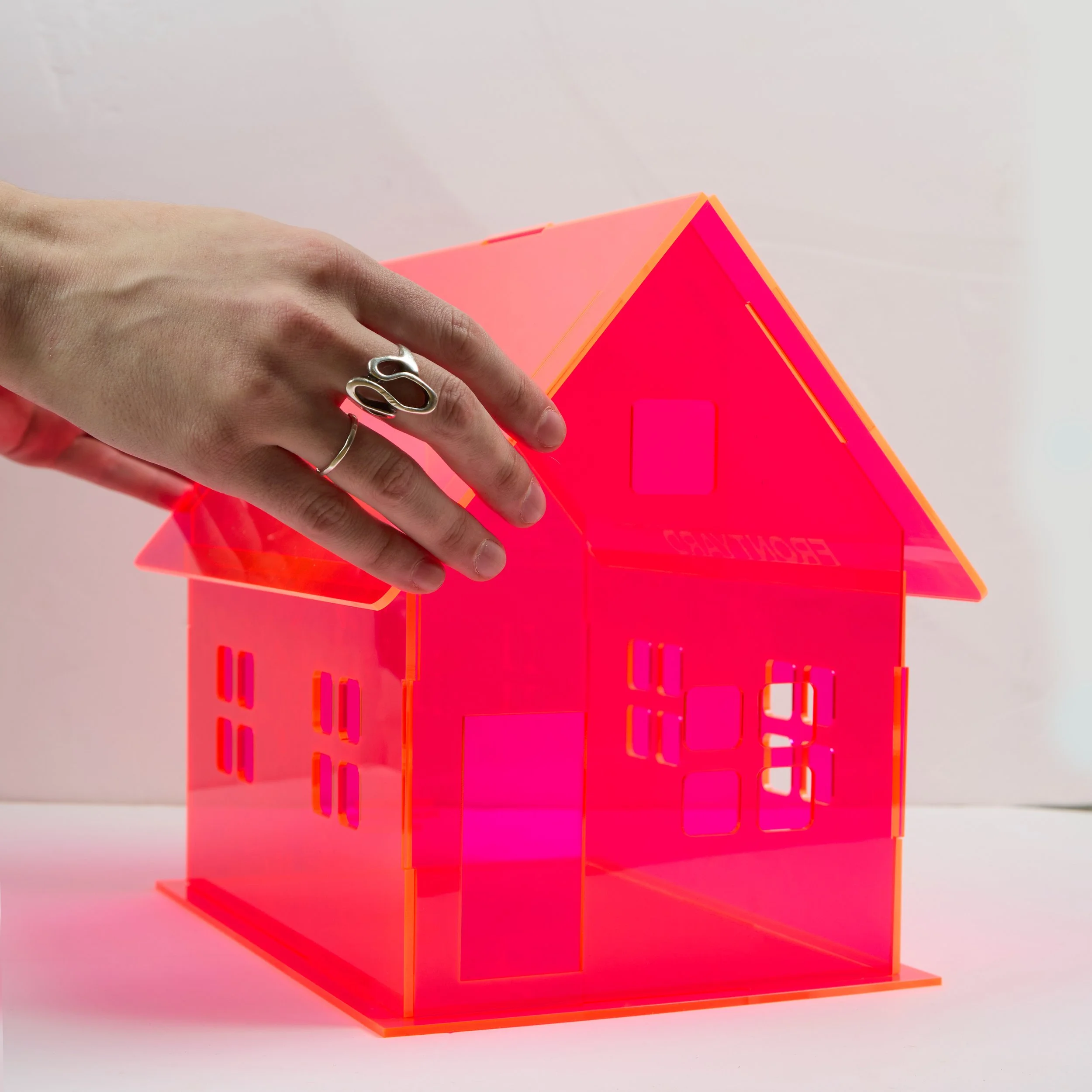
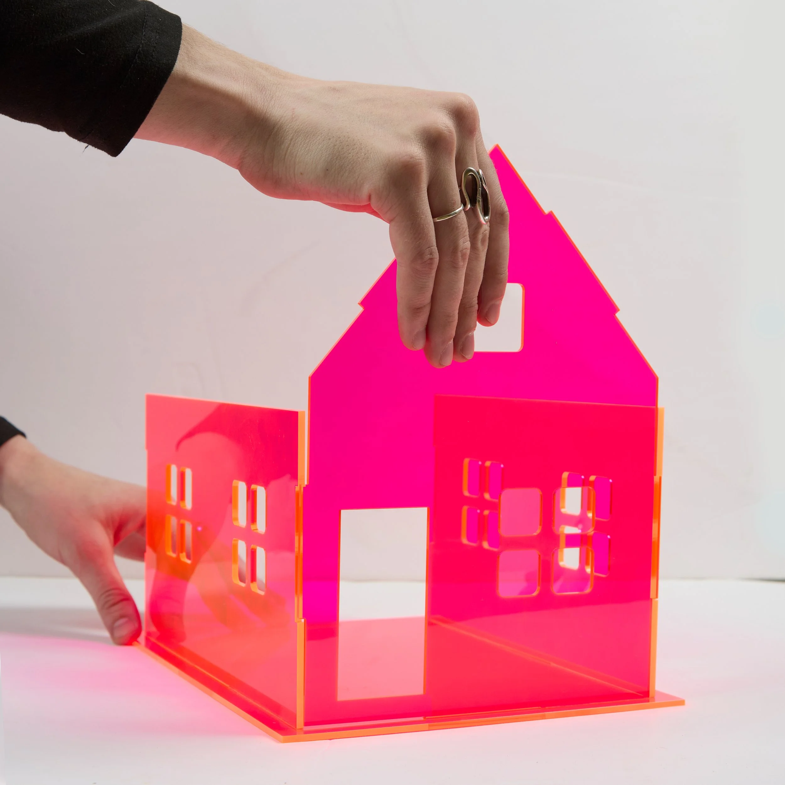
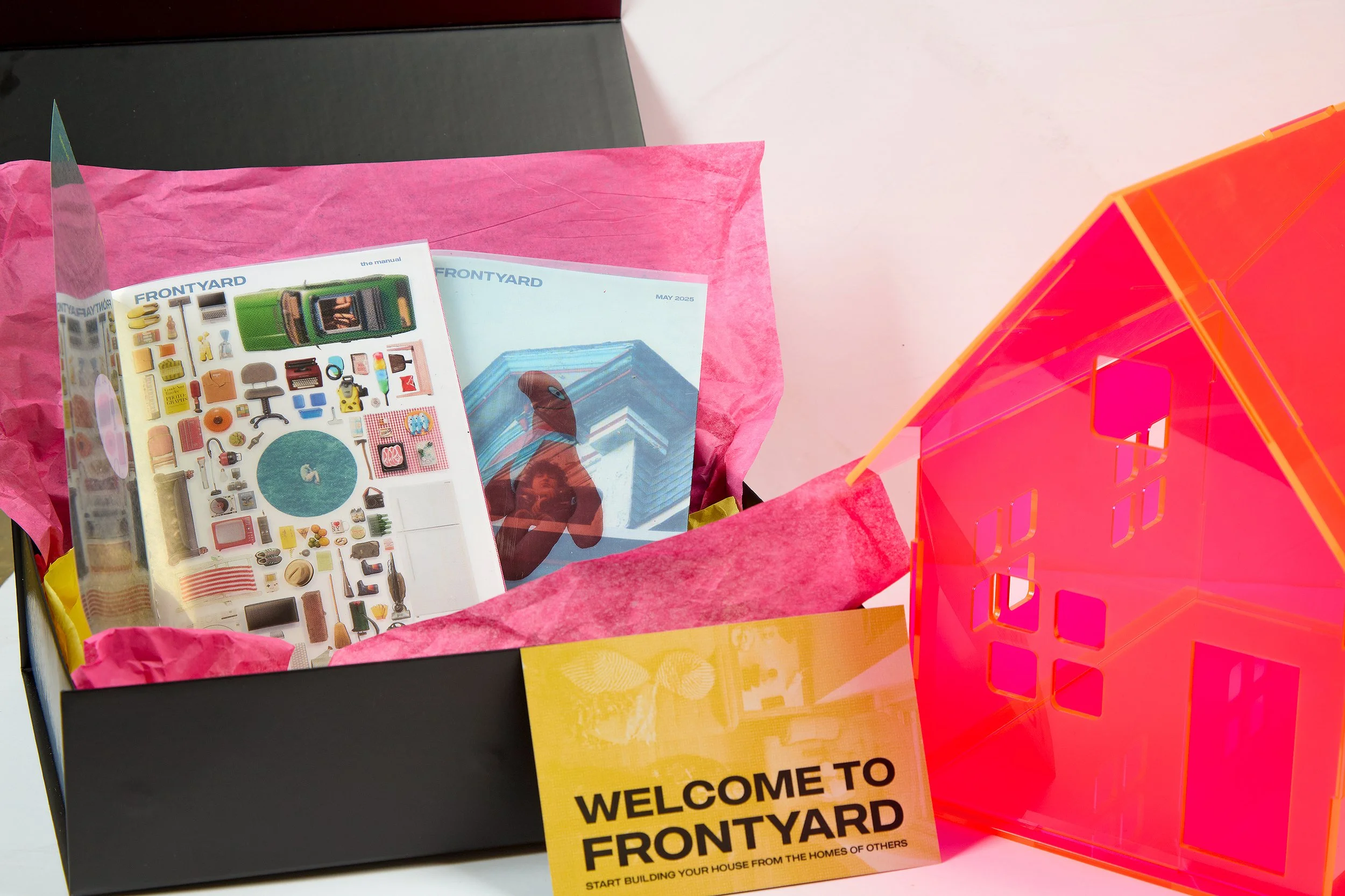
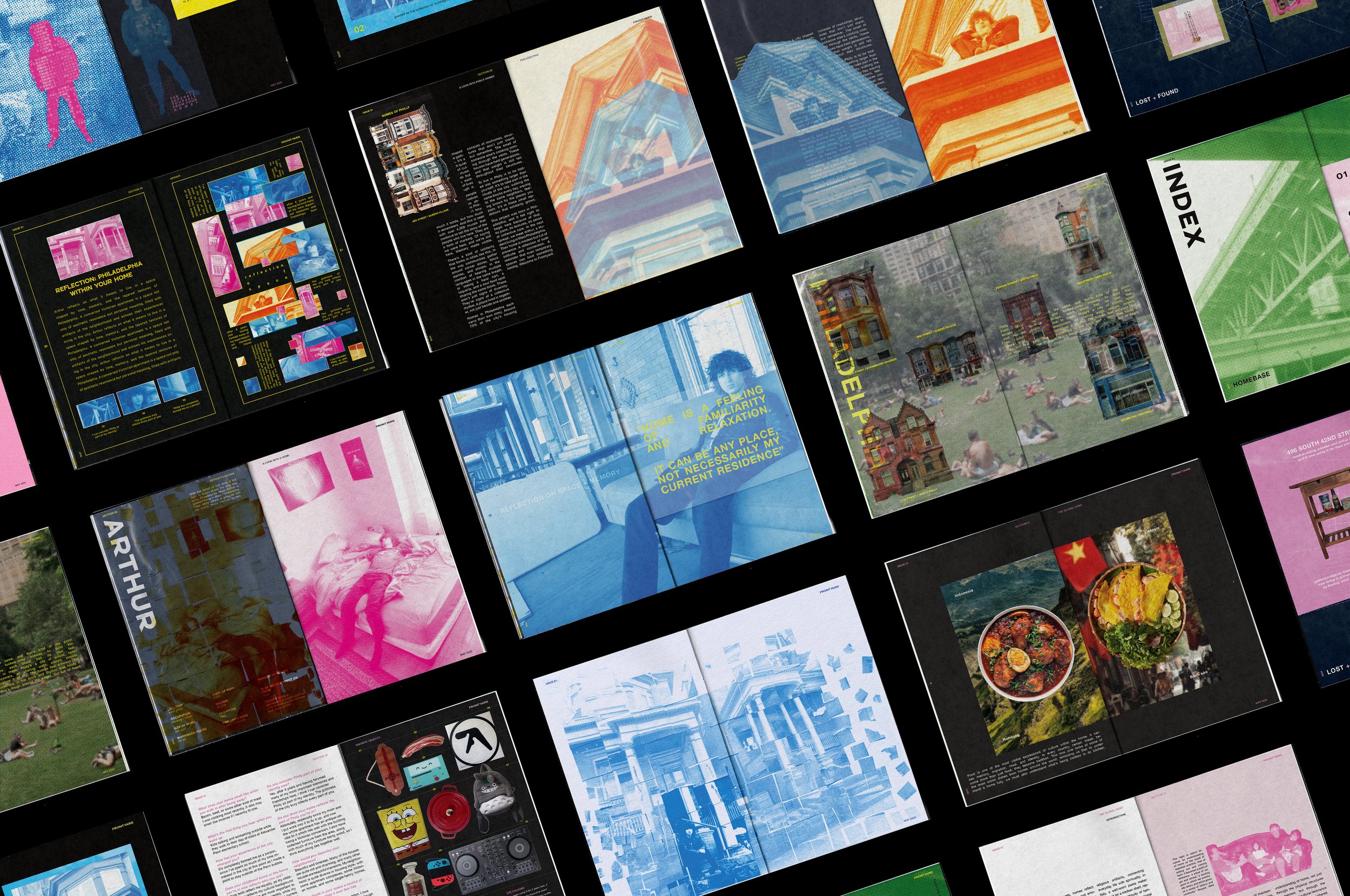
Frontyard is a publication series documenting how identity takes shape through the spaces people live in. The first release includes two zines and a modular acrylic case, building the project into a repeatable editorial system and growing physical archive.

How It Works
Two Zines
Frontyard launches with two zines: Zine 01, The Manual, and Zine 02, Philadelphia.

Initial Release
The first drop includes both zines and the acrylic house. This is the only release where the house is sold together with the printed issues.

Building the Archive
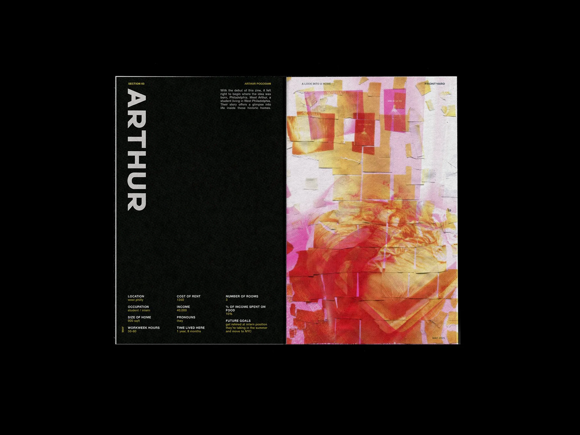
Each new issue focuses on one person’s home in a different city. Issues are printed once, then archived, giving people full control over which locations make up their collection.
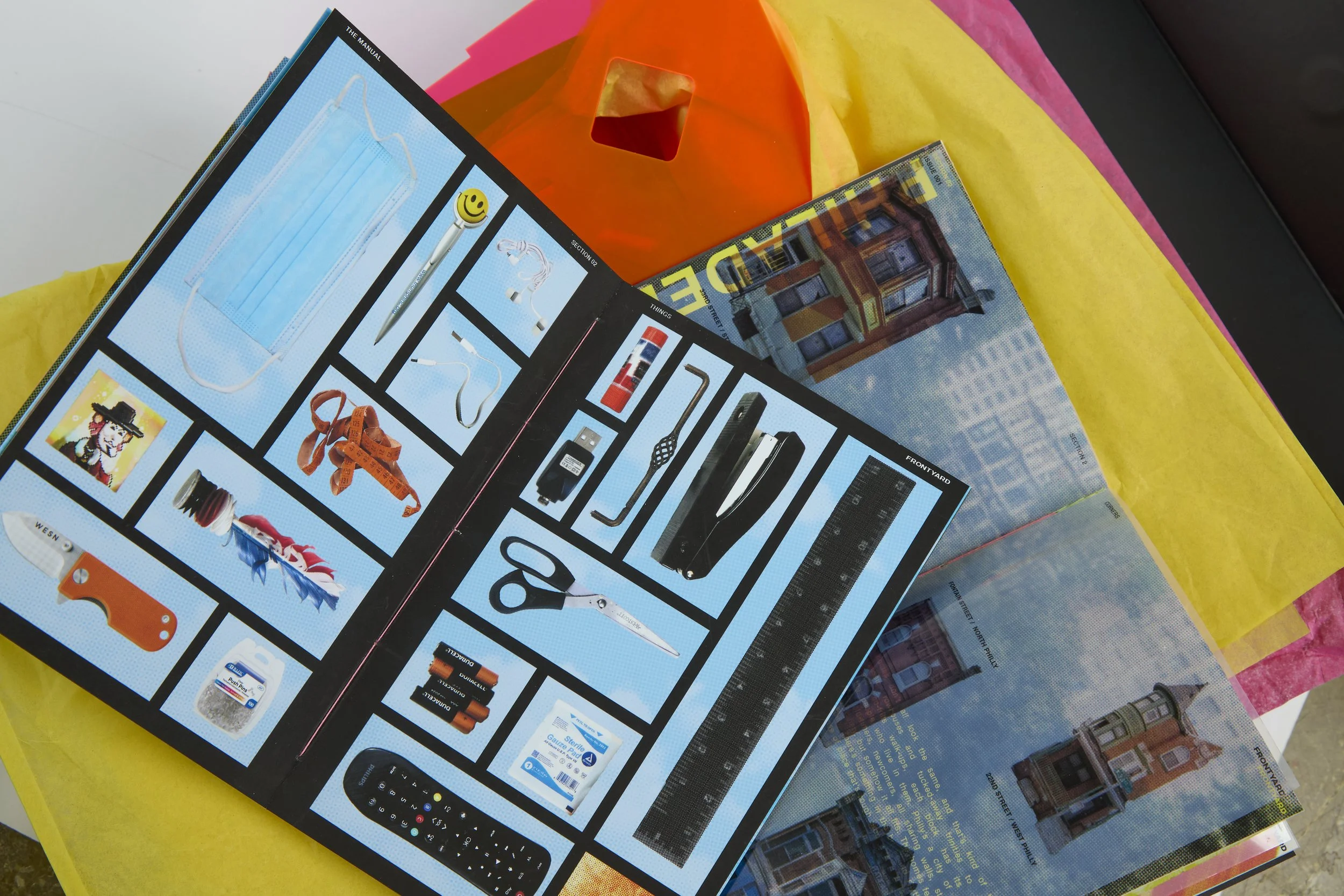
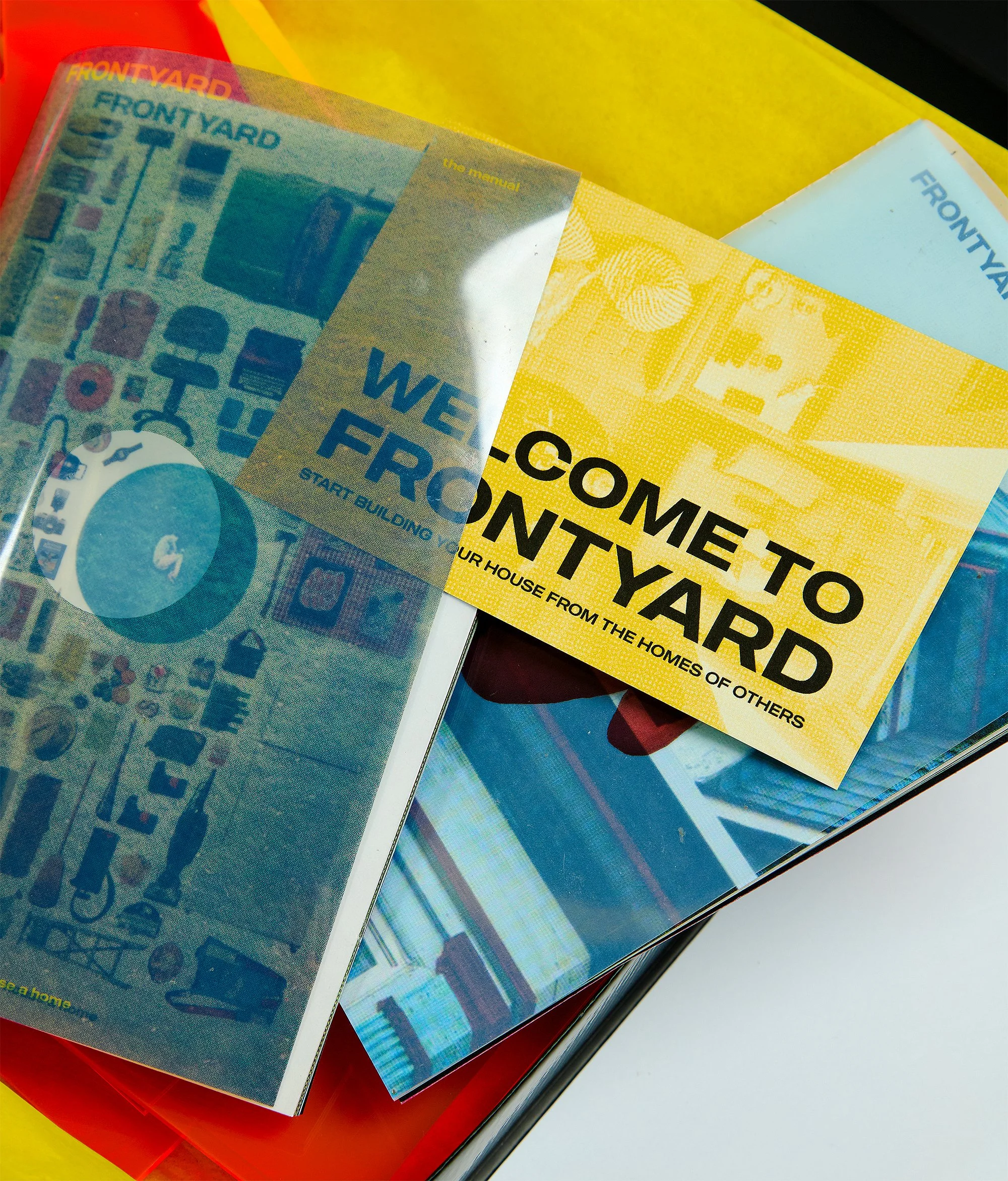
the manual
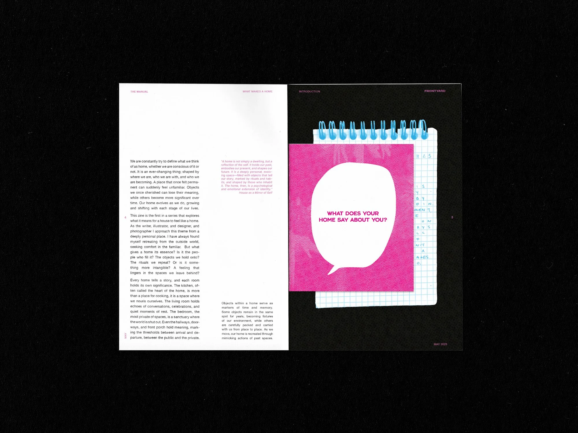
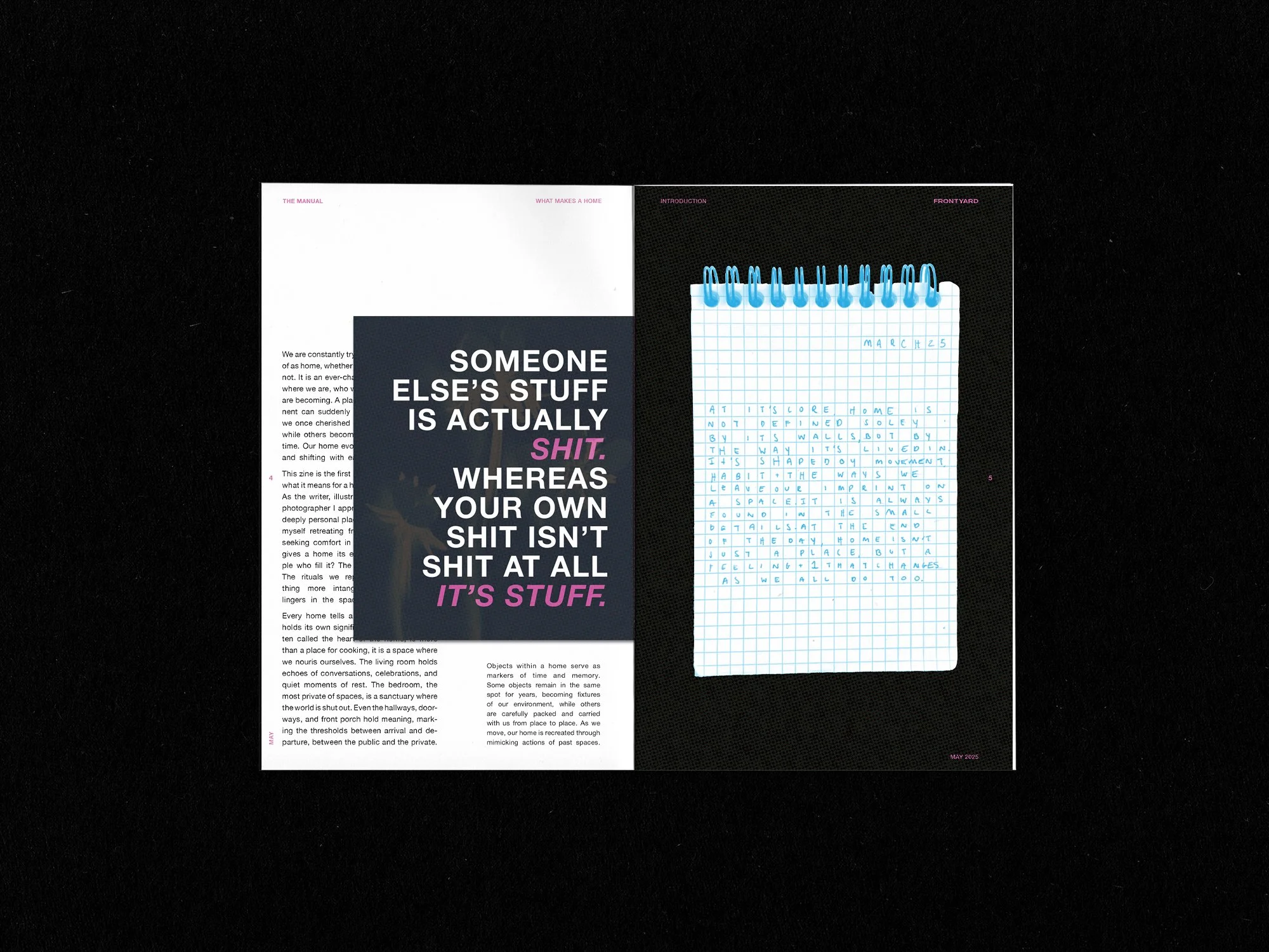
The first zine defines Frontyard’s purpose and turns the research into a format the rest of the series follows. It lays out how information should appear on the page and sets the approach for how text and images work together.


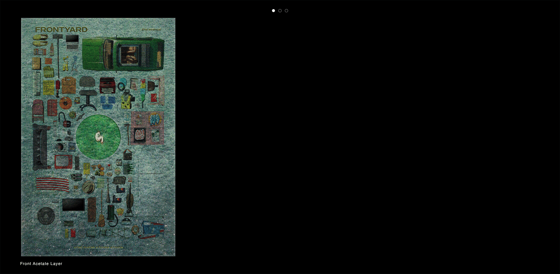
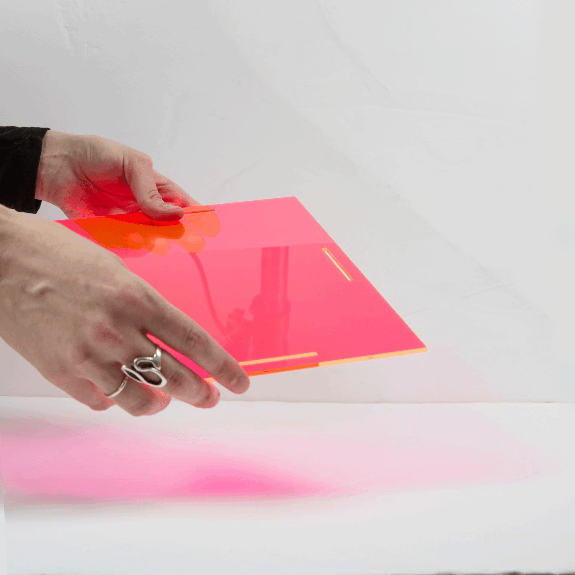
The cover uses acetate to build a physical layering system. Each sheet separates the place, the objects, and the person, mirroring how layers exist within a home.
Cover Design System

Sections

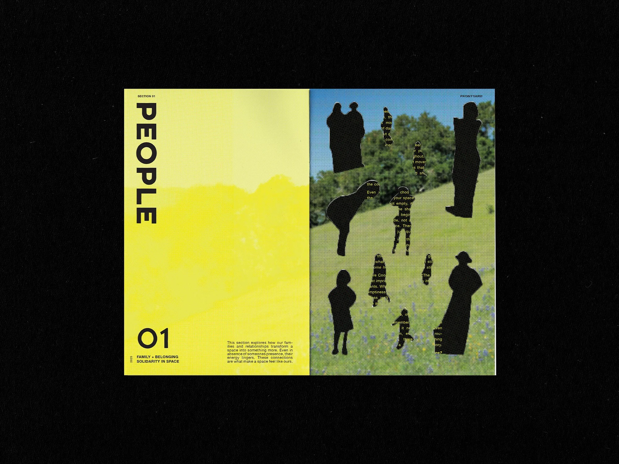
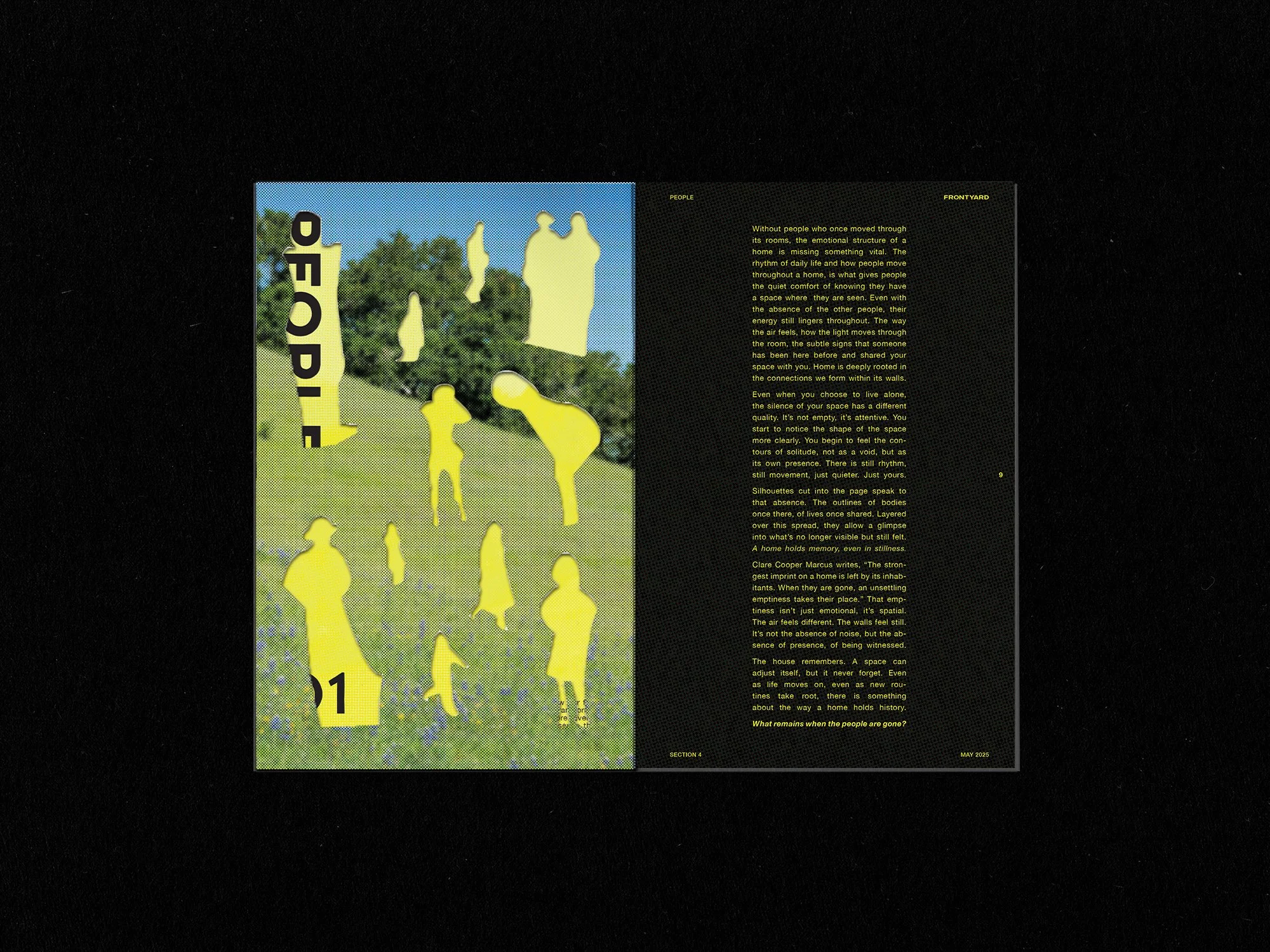
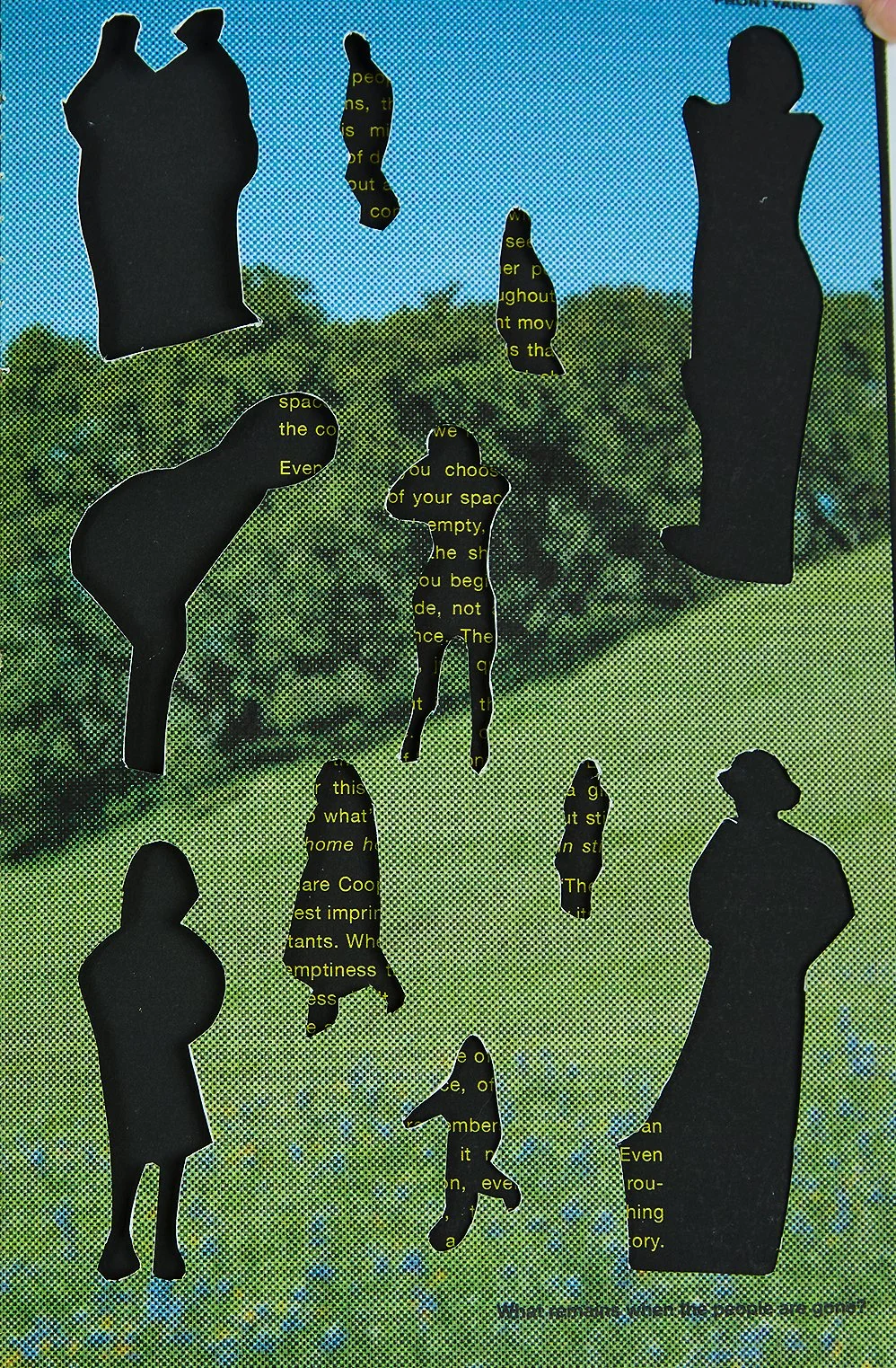
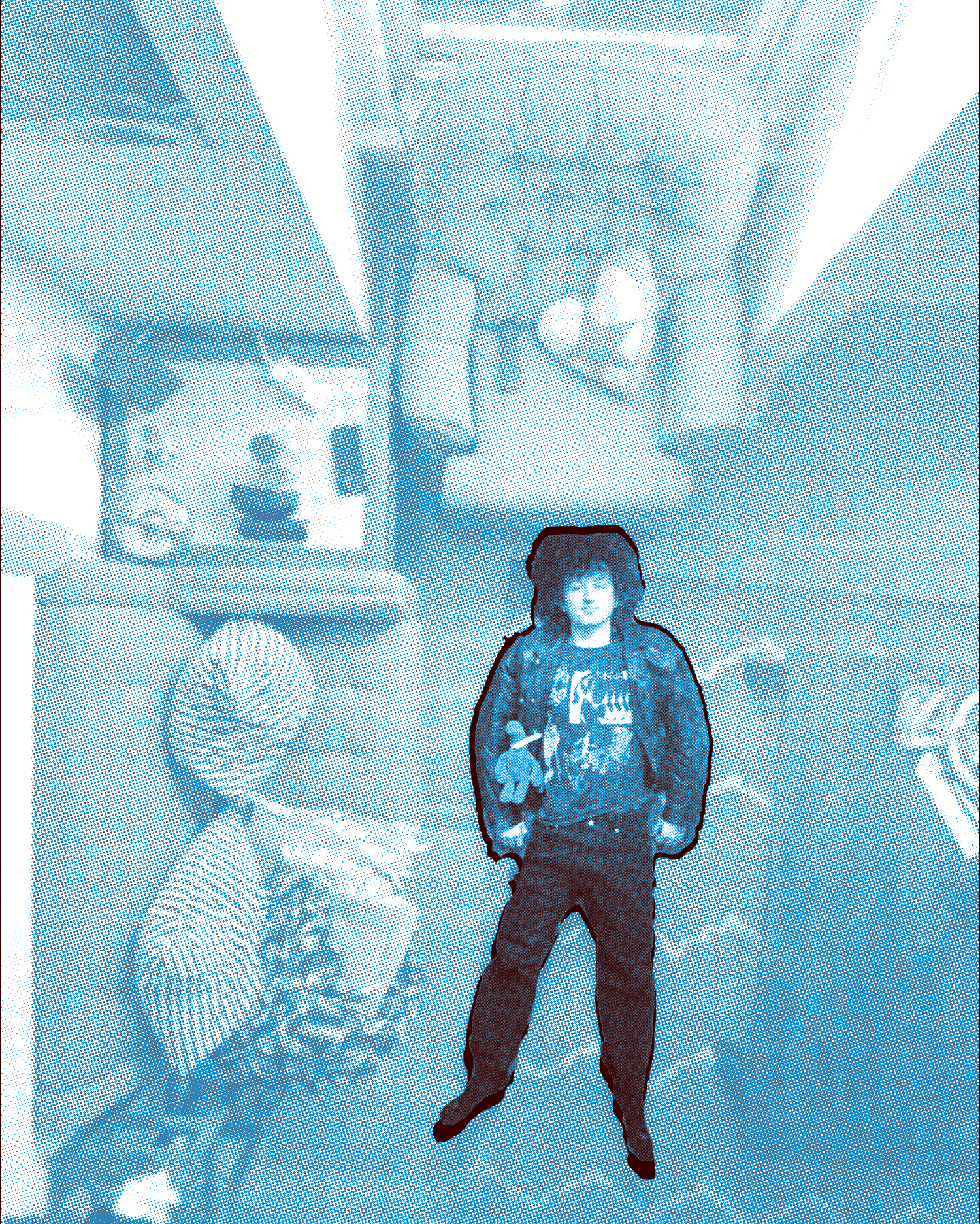
People
What remains when people leave a space shows how presence lingers and shapes the feeling of a home.

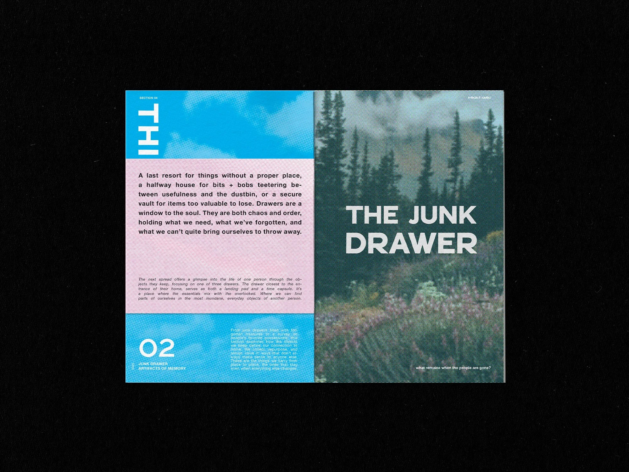
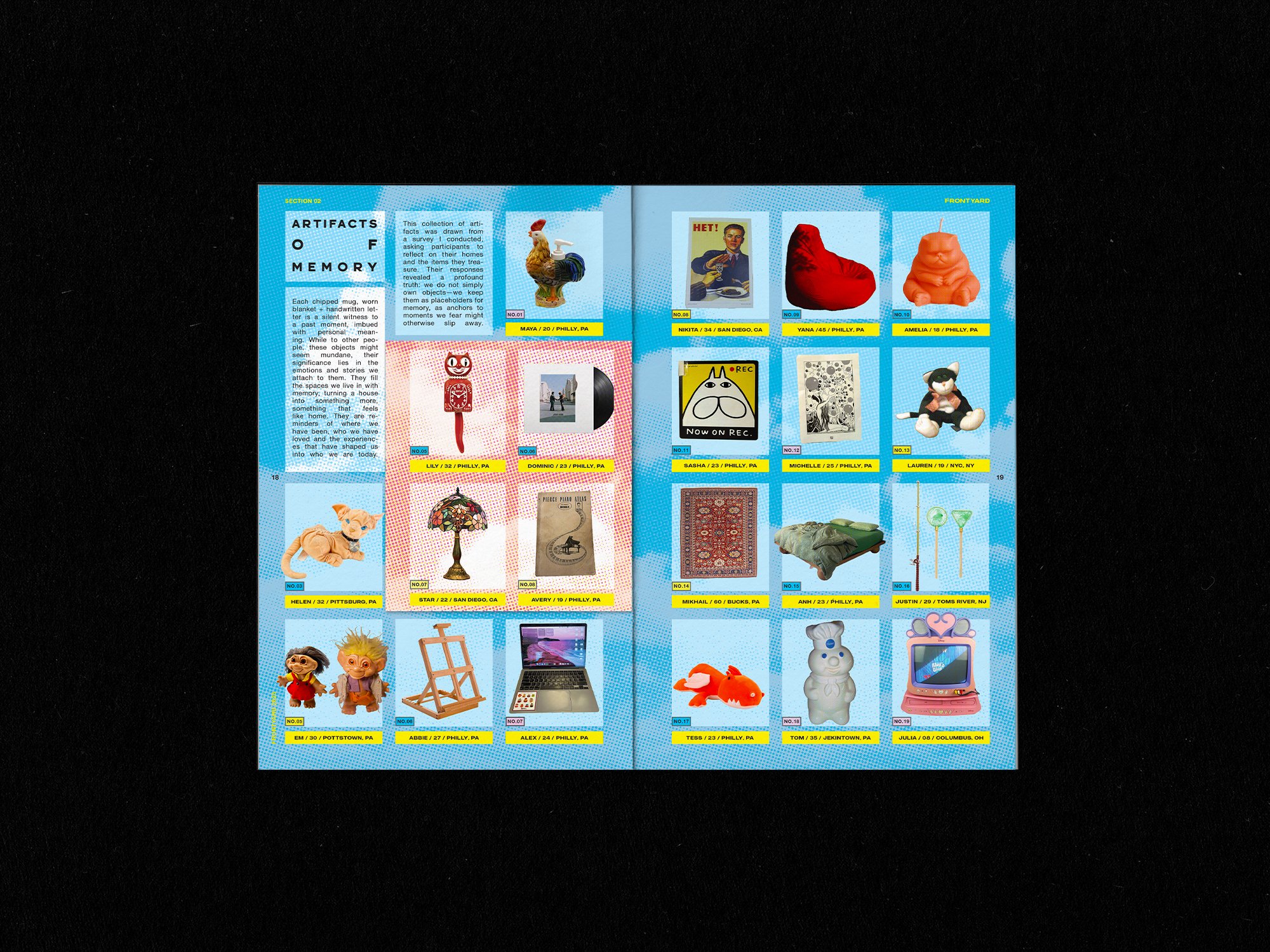
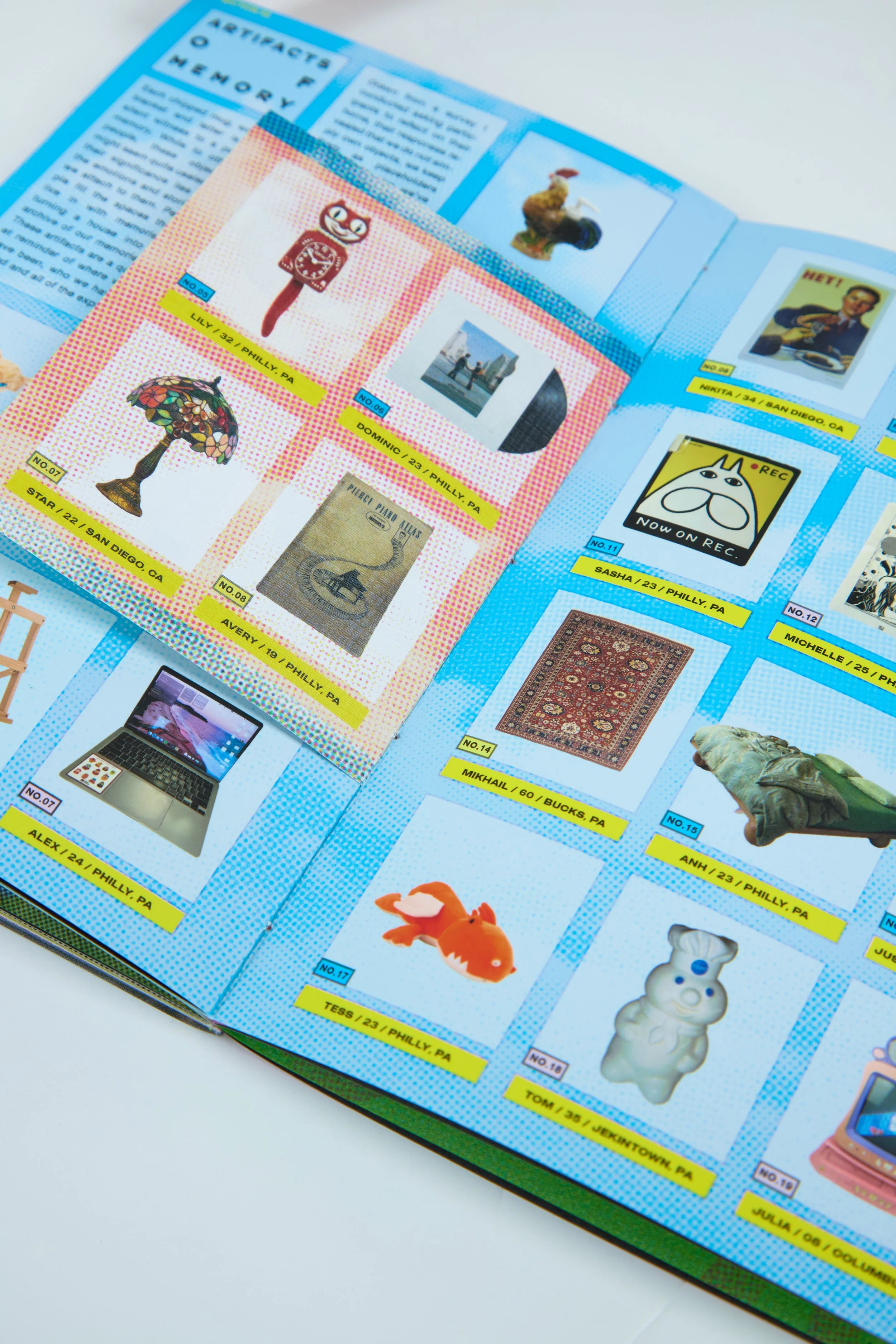
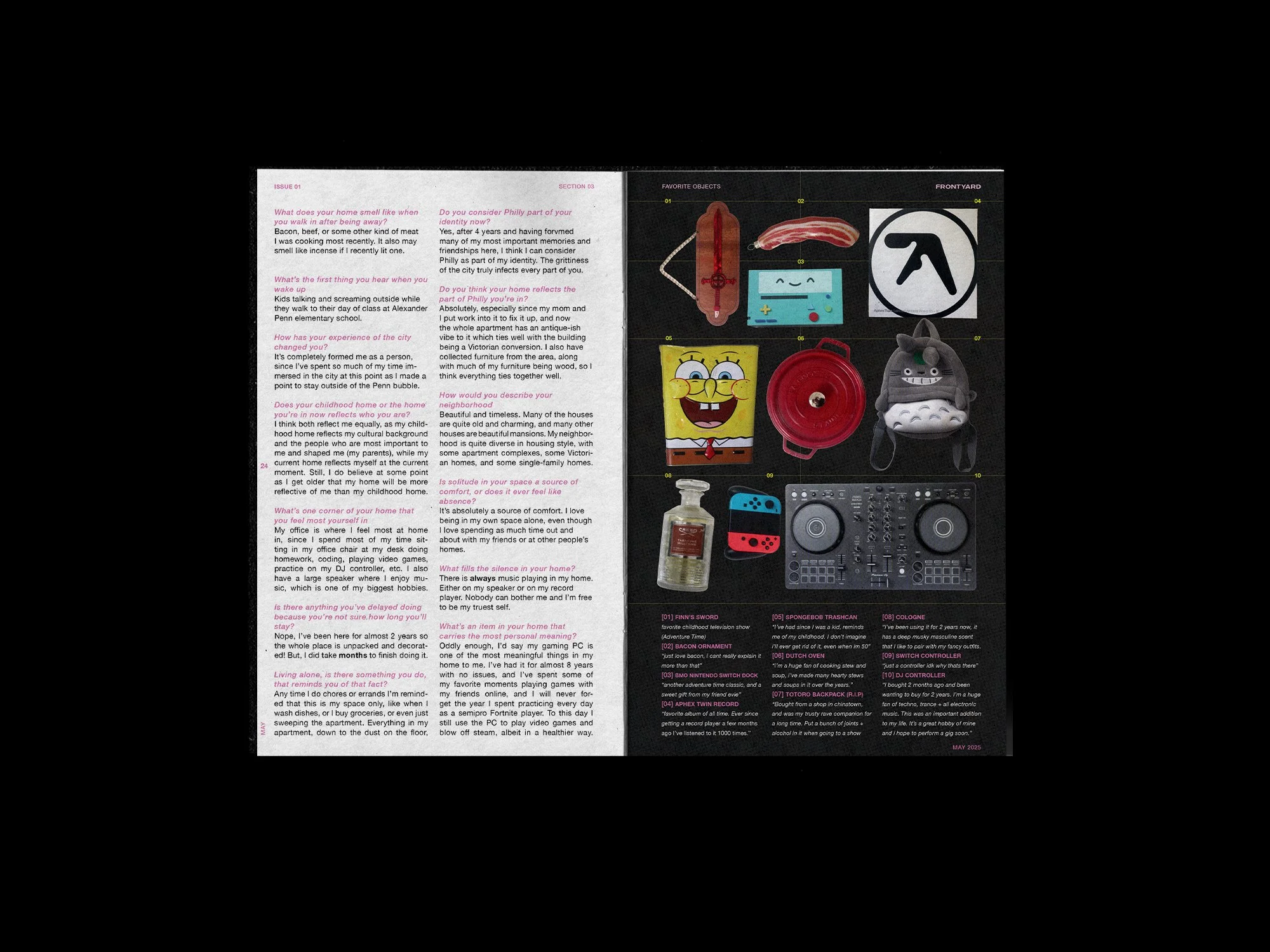
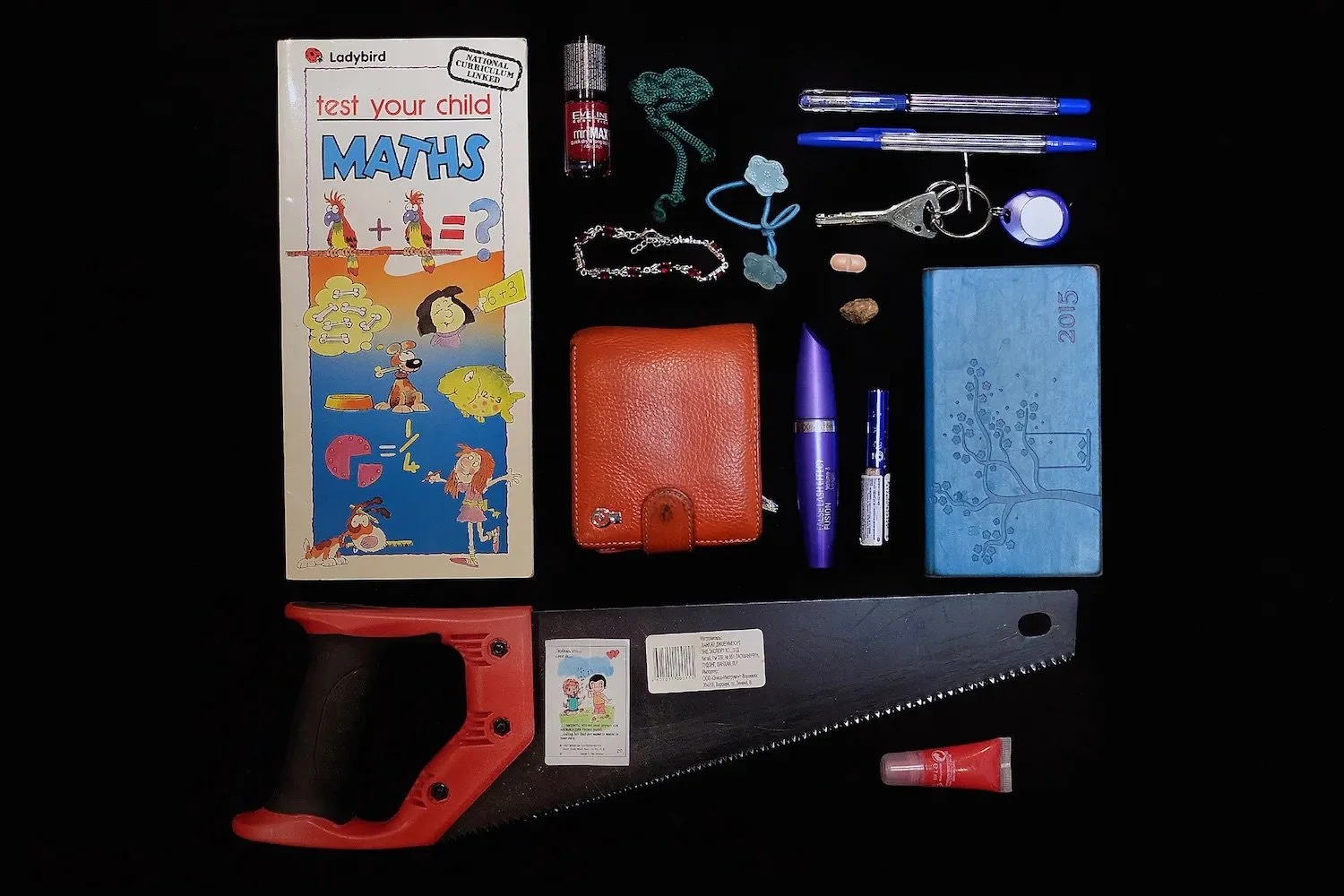
Things
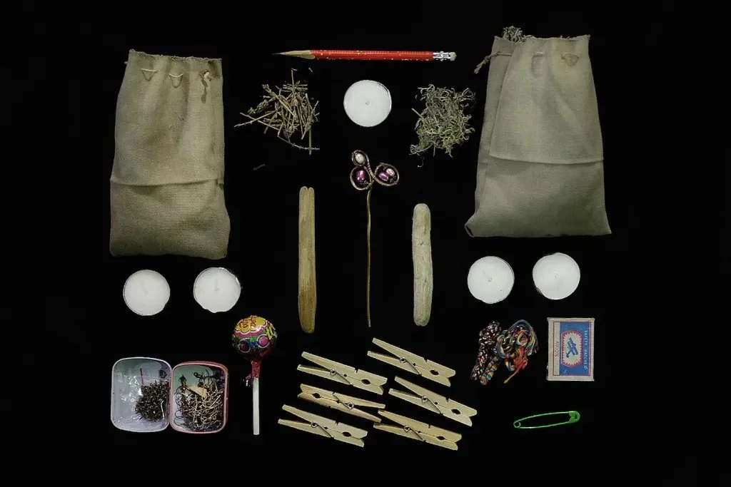
A survey of personal possessions and the study of one junk drawer show how meaning forms in what people keep and what they overlook.
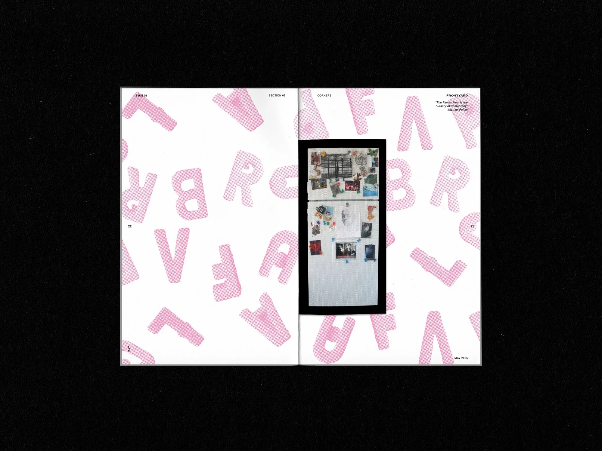
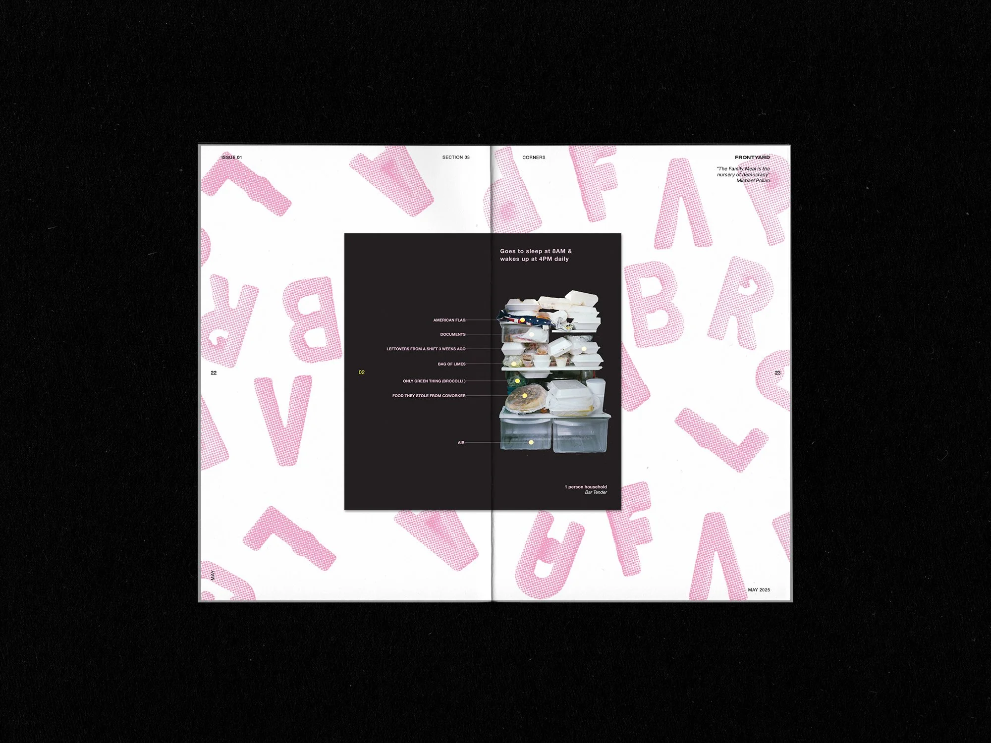
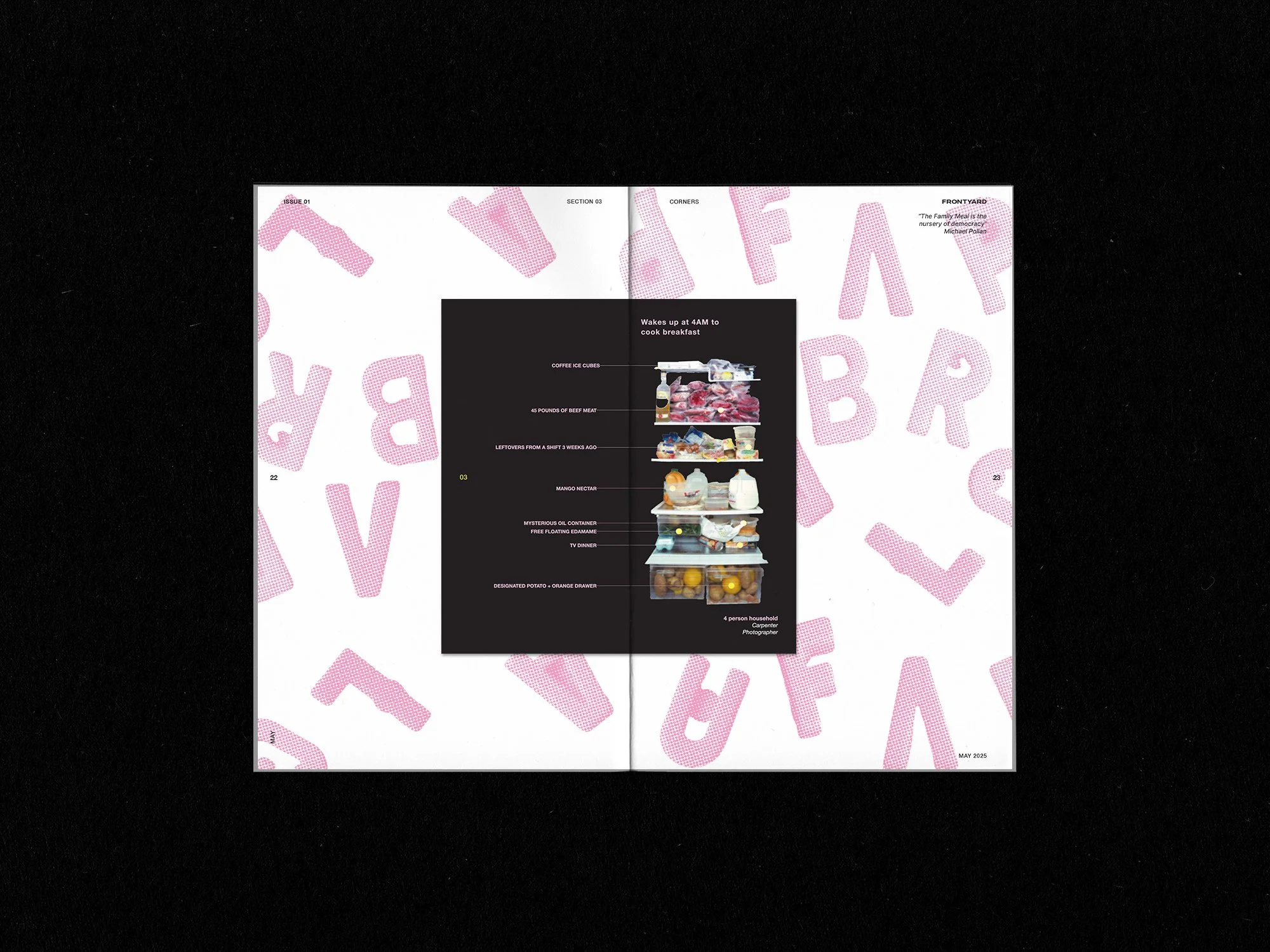
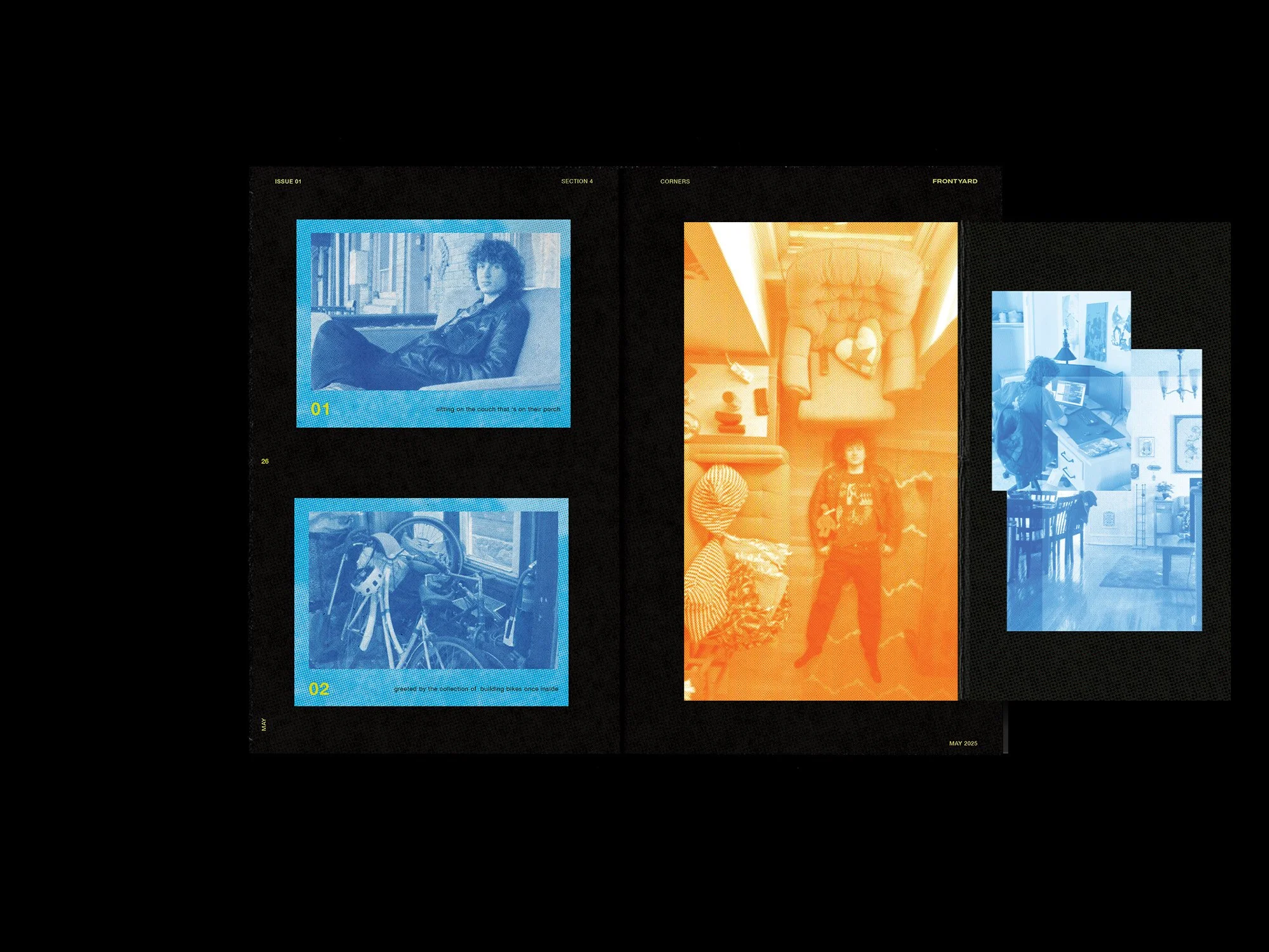
Corners
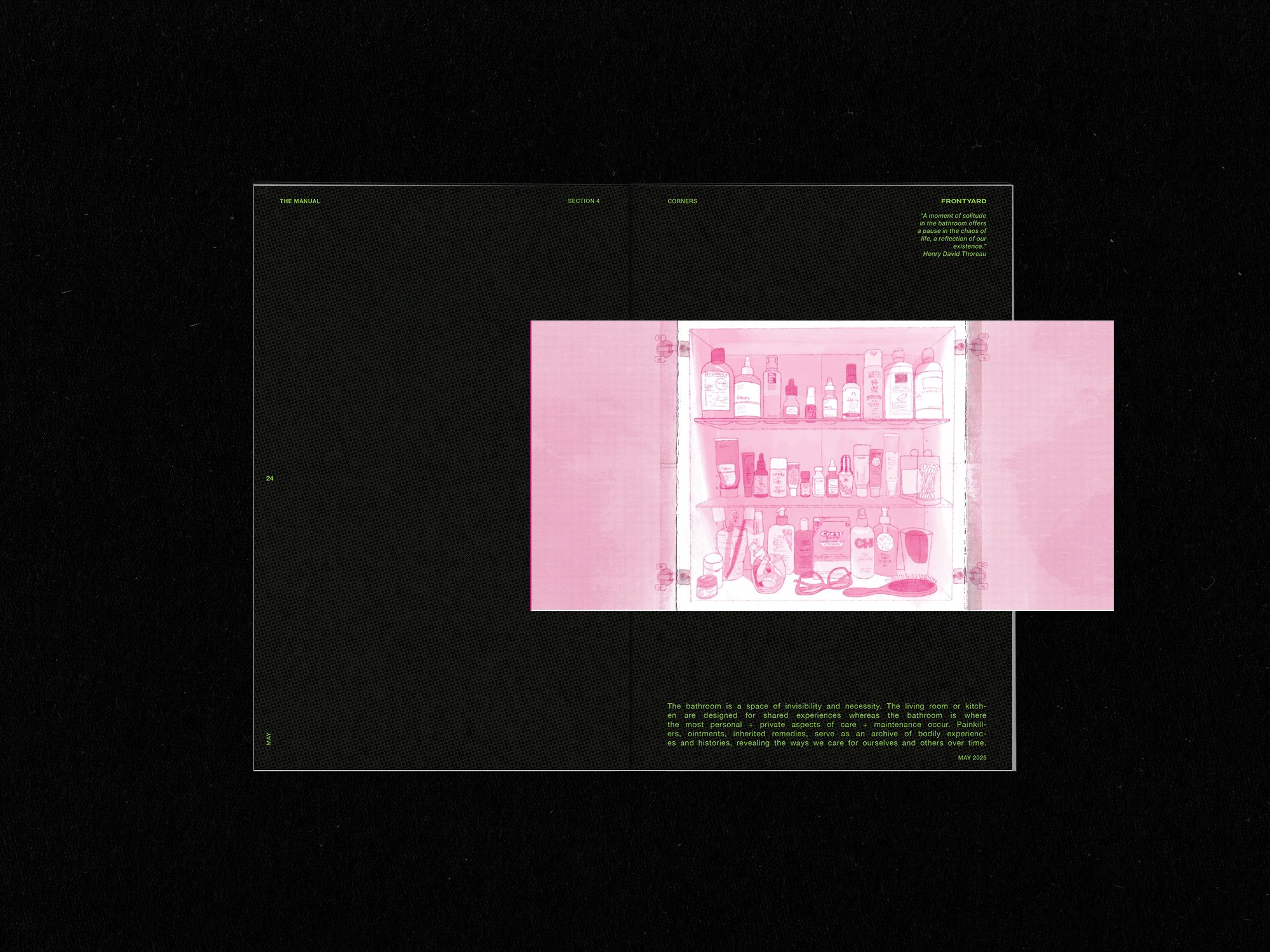
The kitchen and bathroom reveal identity through routine by what stays in the fridge and medicine cabinet, often saying more than any curated space.
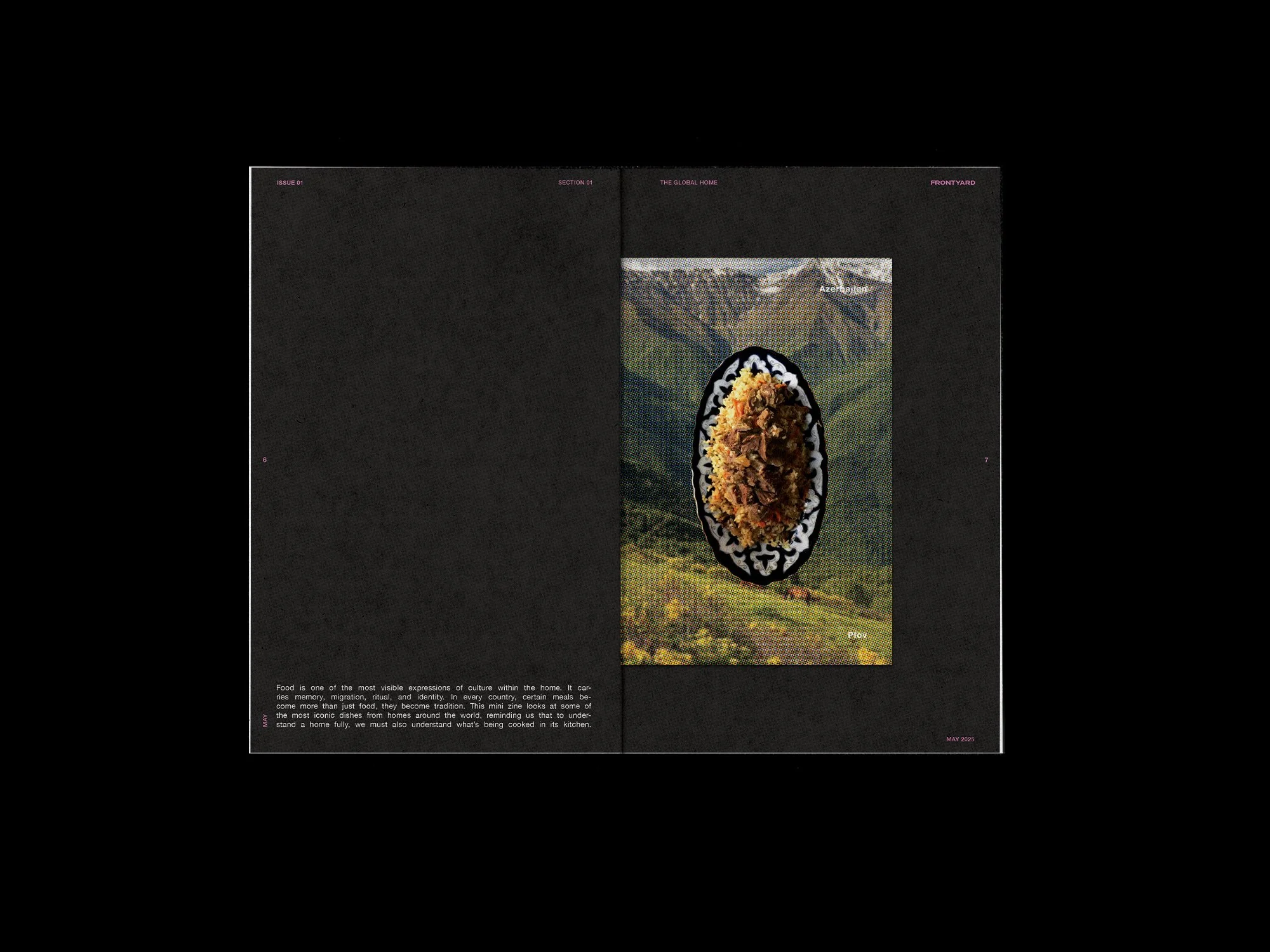
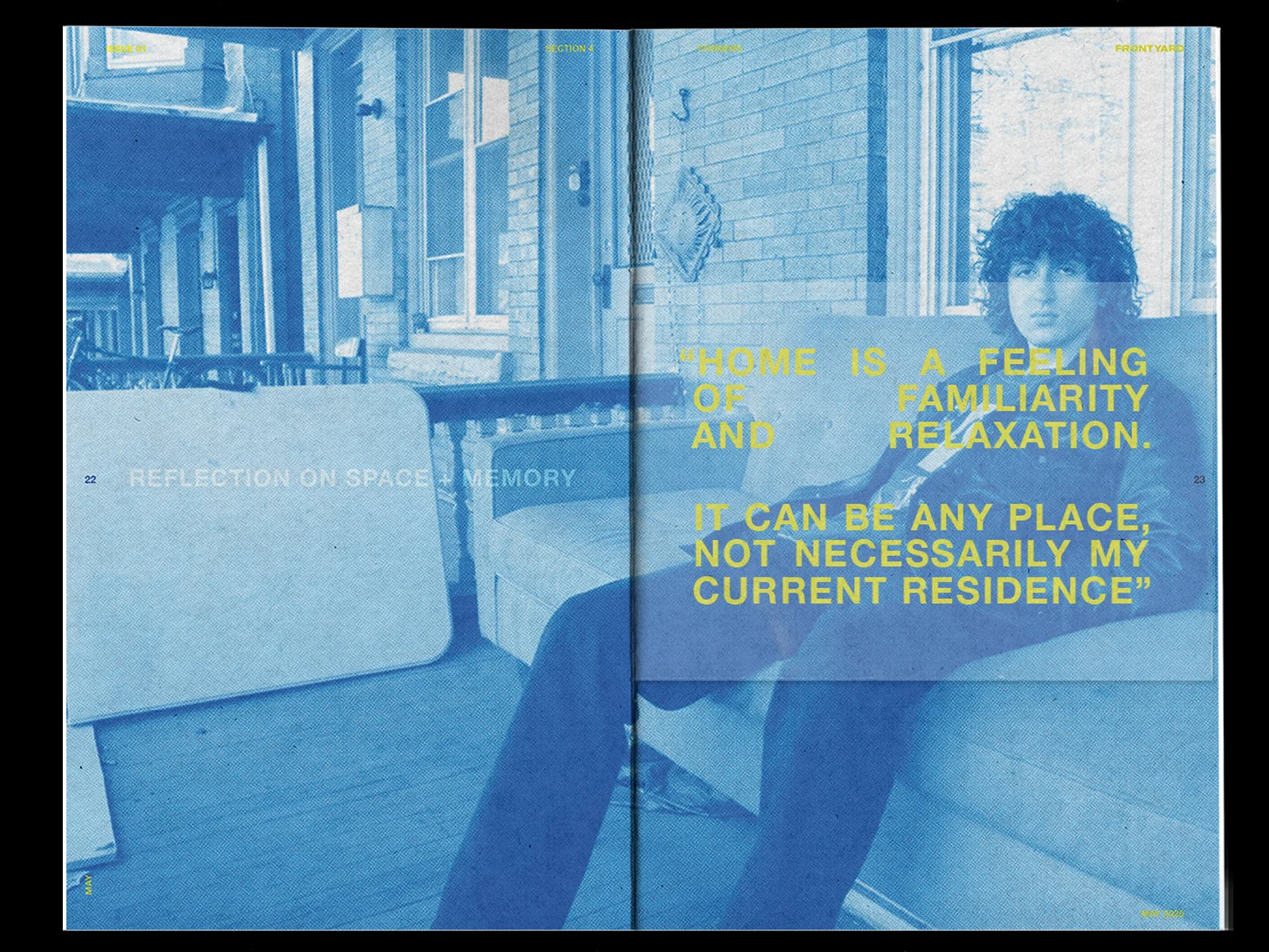
philadelphia
The second zine moves from defining the project to putting it into practice. It focuses on one home in West Philadelphia and shows how the earlier approach functions in a lived space without overwhelming it.


Research
I spent several weeks collecting visual and written research to understand how a home is represented and how those representations shape perception. The text and imagery needed to speak to Frontyard’s theme while standing on their own as personal, grounded narratives.
Most discussions about home center on architecture, market value, or ownership. I focused instead on the everyday habits and objects that shape how people live. To ground that perspective, I created a survey asking participants to share items from their homes and describe what home means to them. Their responses informed the first zine, a manual that sets the foundation for the project. The second zine expands on this through interviews and photographic documentation of one home and its surroundings, connecting the personal space back to the city.


References: Peter Menzel, and Sergei Stroitelev
read more
Frontyard draws from traditions of documentary photography that explore how ordinary objects reflect personal identity. Peter Menzel’s Material World photographed families with all their belongings, revealing how possessions tell quiet stories about people’s lives. Sergei Stroitelev’s portraits of handbags, Mark Menjivar’s refrigerators, and Gabriele Galimberti’s Toy Stories extend that idea by showing how what we keep reflects who we are. The project also references writing that examines the relationship between people and their environments. Daniel Miller’s Home Possessions (2001), Roderick J. Lawrence’s What Makes a House a Home? (1987), and Clare Cooper Marcus’s House as a Mirror of Self (2006) informed how Frontyard approaches design as a way to document personal space through print and the physical act of keeping.
Personalization through Construction